416 Blair Ave,
Reading, PA 19601
![]()
Importance of Kerning and Tracking
Some Background
When designing a project for digital or print, there are a couple of important aspects in design which must be taken into consideration. These important aspects to remember in design are namely kerning and tracking, known to most people simply as letter spacing. So what do these terms mean? Do they really make such a big difference in design? And how do we tell them apart?
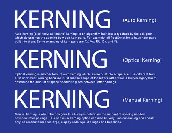
We will start by defining these two design terms. Kerning by definition simply means to adjust the spacing between a letter pairing. Throughout history, characters of the alphabet were never designed with any type of letter spacing in mind; therefore, some letter combinations would appear awkward without applying any type of spacing to them. Presently, a designer can accomplish this process through the use of various page layout programs such as, Adobe Photoshop, Adobe Illustrator, and Quark Express . In most page layout programs, a designer can choose to apply two types of kerning options, namely auto kerning or manual kerning.
The difference between auto and manual kerning

Example of a character box in a typical page layout program
Auto Kerning
Automatic kerning refers to the kerning applied automatically by a program, as opposed to no kerning at all or the kerning applied manually by the user. There are two types of automatic kerning, namely metric and optical.
- Metric kerning utilizes the kerning tables that are built into the typeface. When you select metric kerning in your page layout program, you are using the spacing that was intended by the designer of the typeface. Metric kerning usually looks good, especially at small sizes. Cheap novelty fonts or free fonts often have little or no built-in kerning and will need to be optically or manually kerned.
- Unlike metric kerning, optical kerning uses the shapes of letters to determine what spacing is adequate between a pair of letters rather than a kerning table that is built into the typeface. There is some level of control with optical kerning, but this option will not space letters as accurately in comparison to kerning them manually. However, optical kerning can be a great option when mixing and matching different fonts.
Manual Kerning
The final kerning option is manual kerning. This is considered by many to be the preferred option for most designers and typographers. When kerning type manually, the designer’s eye is what determines the letter spacing between letter parings. This process can be very time-consuming and should only be used to kern large, display-style type.
Tracking
While kerning refers to adjusting the spacing between letter pairs, tracking refers to the overall letter spacing in a selection of letters. This can be a word, a sentence, a paragraph, or an entire document. When applying tracking values, the spacing throughout the text will be equal.
As a rule, designers should adjust the tracking to a body of text before applying any kerning value. If you kern your text first and then apply your tracking values, you will negate the kerning values that were previously applied.
![]()
What Designers Need to Keep in Mind
Now that we have discussed and defined the differences between kerning and tracking in design, the following are some things to remember when manipulating text’s kerning and tracking:
- Always start with the difficult pairings, like capital/lowercase pairings, diagonal letters (like X, V, and Z) and round letters (like O, B, and D).
- Adjust kerning values as a last step in your design, especially after you choose a font. Remember every font is different.
- Try kerning your text upside down. Kerning text upside down can help to focus on letter pairings rather than the entire word..
- The goal of kerning is for the type to appear optically correct. There is no secret formula to this process, and often times it just takes practice.
- Here is a game to test your kerning your skills.
The web designers at DaBrian will be sure to take your website to the next level. Contact us today!


Subscribe to our Blog
Recent Posts
Categories
- Marketing Strategy (126)
- web design (82)
- digital marketing (71)
- Search Engine Optimization (SEO) (62)
- Paid Search (PPC) (59)
- Digital Analytics (55)
- seo (51)
- Google Analytics (50)
- News & Events (48)
- Social Media Marketing & Management (46)
- Content Marketing (45)
- PPC (43)
- Ecommerce & Retail Marketing (39)
- Business to Business Marketing (34)
- Mobile marketing (33)
- Website design (32)
- eCommerce (31)
- local seo (30)
- Inbound marketing (29)
- B2B marketing (26)
- social media (26)
- email marketing (25)
- social media marketing (25)
- B2B (24)
- website redesign (23)
- Financial Services (22)
- website development (21)
- Pay Per Click (20)
- SEO strategy (20)
- B2B marketing agency (19)
- marketing (19)
- web development (19)
- Google AdWords (17)
- press release (16)
- Social Media Management (15)
- ecommerce marketing (15)
- marketing automation (15)
- social media strategy (15)
- content (14)
- lead generation (14)
- web design services for small business (14)
- sales (13)
- Digital Branding (12)
- Healthcare & Wellness (12)
- Video Marketing (12)
- Web Design Strategy/Website Strategy (12)
- Web Design Trends (12)
- branding (12)
- search engine optimization (12)
- Analytics (11)
- Artificial intelligence (AI) (11)
- Retail Marketing (11)
- SEM (11)
- Social Strategy (11)
- digital advertising (11)
- financial services marketing (11)
- increase brand awareness (11)
- internet marketing (11)
- online shopping (11)
- web analytics (11)
- Healthcare Marketing (10)
- Lead Generation Marketing (10)
- SEO Services (10)
- financial advisors marketing (10)
- local listing management (10)
- responsive web design (10)
- Bank Marketing (9)
- CRM (9)
- Content Planning (9)
- Google Ads (9)
- Home Services (9)
- Inbound Marketing Strategies (9)
- PPC Marketing (9)
- WordPress (9)
- content development (9)
- content strategy (9)
- 2024 Planning (8)
- B2C Marketing (8)
- Retail Sales (8)
- Shopify (8)
- Web Security (8)
- b2b sales (8)
- financial marketing (8)
- project management (8)
- redesign website (8)
- social marketing (8)
- social media analytics (8)
- strategic marketing (8)
- web designer (8)
- website (8)
- 2025 Planning (7)
- AdWords (7)
- Bing Ads (7)
- Mobile design (7)
- Sales Strategy (7)
- Social Media Metrics (7)
- brand identity (7)
- business strategy (7)
- content optimization (7)
- link building (7)
- mobile (7)
- mobile website (7)
- ppc advertising (7)
- social tips (7)
- AI Content (6)
- CMS (6)
- Customer Persona (6)
- Link Earning (6)
- Online Sales (6)
- ROI (6)
- SEO Agency (6)
- SEO measurement (6)
- Search Engine Marketing (6)
- account-based marketing (6)
- brand development (6)
- digital marketing agency (6)
- digital marketing strategy (6)
- home services marketing (6)
- hubspot cms (6)
- measurement (6)
- news and events (6)
- shopify website (6)
- shopping ads (6)
- small business (6)
- social analytics (6)
- strategy (6)
- Paid Search (5)
- Plumbing Marketing (5)
- brand guidelines (5)
- business to business (5)
- customer relationship management (5)
- customer relationship management tools (5)
- google shopping (5)
- hubspot agency (5)
- inbound marketing strategy (5)
- keyword research (5)
- lead generation website (5)
- marketing insights (5)
- marketing tips (5)
- measuring SEO (5)
- paid search campaigns (5)
- ppc management (5)
- sales CRM (5)
- user experience (5)
- video (5)
- Artificial Intelligence (4)
- CMS Hub (4)
- Call Tracking (4)
- Facebook (4)
- Improve productivity (4)
- Inbound Sales Strategy (4)
- Insurance Marketing (4)
- KPIs (4)
- Local Listings (4)
- Logo Design (4)
- Non-Profit Marketing (4)
- Outbound Sales Strategy (4)
- SERPS (4)
- Uncategorized (4)
- Wealth Management marketing (4)
- compliance (4)
- conversions (4)
- creative design (4)
- credit union (4)
- customer relationship system (4)
- dabrian marketing (4)
- data (4)
- ecommerce SEO (4)
- email (4)
- home improvement (4)
- leads (4)
- mobile advertising (4)
- news (4)
- optimization (4)
- paid online advertising (4)
- sales funnel (4)
- sales pipeline (4)
- security (4)
- smart goals (4)
- social advertising (4)
- social media tips (4)
- tag management (4)
- trends (4)
- web developer (4)
- 2023 (3)
- 2026 planning (3)
- Adobe Analytics (3)
- Amazon Advertising (3)
- Automotive Marketing (3)
- B2B Content (3)
- B2B Search Marketing (3)
- B2B eCommerce (3)
- B2C (3)
- Continuous Website Improvement (3)
- Google My Business (3)
- Growth Driven Design (3)
- HVAC (3)
- Home Improvement Marketing (3)
- Hospital Marketing (3)
- Lawn Care Marketing (3)
- LinkedIn (3)
- Marketing Budgeting (3)
- Measurement Planning (3)
- Multivariate Testing (3)
- Online Business (3)
- Organic Search (3)
- Partnership (3)
- Personas (3)
- Product Inventory (3)
- SEO Reporting (3)
- SOCIAL ECOMMERCE (3)
- Sales Prospecting (3)
- Sales and Marketing Alignment (3)
- Social media updates (3)
- Time Management (3)
- Twitter (3)
- UX Design (3)
- UX research (3)
- adCenter (3)
- advertising (3)
- aeo (3)
- api (3)
- attribution modeling (3)
- bank advertising (3)
- big data (3)
- construction marketing (3)
- consumer services (3)
- customer (3)
- data privacy (3)
- digital content (3)
- digital marketing measurement (3)
- digital marketing services (3)
- email for ecommerce (3)
- facebook ads (3)
- google partners connect (3)
- graphic design (3)
- hubspot (3)
- hubspot crm (3)
- hubspot sales (3)
- instagram (3)
- local search (3)
- manufacturing marketing (3)
- marketing metrics (3)
- minority owned businesses (3)
- monitor (3)
- omnichannel Marketing (3)
- on-page seo (3)
- online reputation management (3)
- online store (3)
- paid search advertising (3)
- pay per click advertising campaigns (3)
- plumbing (3)
- ppc account management (3)
- reputation management (3)
- sales enablement (3)
- tips (3)
- voice search (3)
- #agencylife (2)
- 2022 (2)
- 2023 planning (2)
- 2024 (2)
- ABM (2)
- B2B growth (2)
- BigCommerce (2)
- Business growth opportunities (2)
- COVID (2)
- CRM alignment (2)
- Conversion Tracking (2)
- Covid-19 (2)
- Facebook Tips (2)
- Facebook business (2)
- GDPR (2)
- Gmail tips (2)
- Google Business Profile (2)
- Google event (2)
- Home Improvement Trends (2)
- LinkedIn Ads (2)
- Minority Business Enterprise (2)
- Online Advertising (2)
- Product Data Feed (2)
- Qualitative Data (2)
- Restaurant Marketing (2)
- SBE (2)
- Speed-to-Lead (2)
- Twitter Tips (2)
- UX (2)
- Video SEO (2)
- Yelp (2)
- ad copy (2)
- agency transparency (2)
- algorithm management (2)
- automated bidding (2)
- budget (2)
- business growth (2)
- certification (2)
- client appreciation (2)
- clients (2)
- cloud (2)
- communication (2)
- content promotion (2)
- copywriting (2)
- data driven culture (2)
- data mining (2)
- design (2)
- digital avertising (2)
- digital transformation (2)
- digital vs traditional (2)
- education (2)
- email analytics (2)
- email marketing measurement (2)
- enhanced campaigns (2)
- guide (2)
- healthcare marketing agency (2)
- hootsuite (2)
- hosting services (2)
- implementing (2)
- inbound leads (2)
- inbound success plan (2)
- industries (2)
- industry solutions (2)
- insurance and trust (2)
- interactive content (2)
- internet (2)
- landing (2)
- landing page (2)
- lead generation tools (2)
- lehigh valley (2)
- local business (2)
- local event (2)
- local listing (2)
- logo types (2)
- marketing tools (2)
- measure (2)
- mobile analytics (2)
- mobile app (2)
- mobile optimization (2)
- mobile seo (2)
- multichannel (2)
- multichannel marketing (2)
- native ads (2)
- news release (2)
- non-profit (2)
- nonprofit marketing (2)
- one page web design (2)
- operations process (2)
- outbound marketing (2)
- phone calls (2)
- platform (2)
- rackspace (2)
- reading pa (2)
- remarketing (2)
- retargeting (2)
- sales plan (2)
- segmentation (2)
- self marketing (2)
- social (2)
- social commerce (2)
- social media agency (2)
- staffing and recruitment (2)
- successful (2)
- target audience (2)
- tariffs (2)
- technical seo (2)
- testing (2)
- tracking (2)
- universal analytics (2)
- website optimization (2)
- work platforms (2)
- workflows (2)
- 1 page sales plan (1)
- 2021 (1)
- 2022 planning (1)
- 5 basic principles (1)
- AAF (1)
- AAF-GLV (1)
- ADA Compliance (1)
- Alignment (1)
- American Advertising Federation (1)
- American Advertising Federation Greater Lehigh Val (1)
- AuthorRank (1)
- Backlinks (1)
- Bank Lead Generation (1)
- Brightlocal (1)
- Business Operations (1)
- Cheap SEO Services (1)
- Cloud U (1)
- Cold Calls (1)
- Cold Email (1)
- Cold Outreach (1)
- Copywriter (1)
- Display Advertising (1)
- Dynamic Text (1)
- Employee Advocacy (1)
- Financial SEO (1)
- First Party Data (1)
- Fractional Marketing (1)
- GK Elite (1)
- General (1)
- Google AI Mode for Healthcare (1)
- Google Guidelines (1)
- Google Marketing Live (1)
- Google Rankbrain (1)
- Google Rankings (1)
- Google reviews (1)
- Google+ (1)
- Growth Strategy (1)
- HIPPA Compliance (1)
- Healthcare AI Search (1)
- Healthcare Automation (1)
- Hospitality & Travel (1)
- Hubspot Onboarding (1)
- Independent Medical Practice (1)
- Independent Medical Practices (1)
- Independent Practice (1)
- Landscaping (1)
- Landscaping Marketing (1)
- Legal advice (1)
- Load-Time (1)
- Logistics (1)
- MBE (1)
- MWBE (1)
- Maintenance Membership (1)
- Manufacturing (1)
- Medial PPC (1)
- Medical Practice SEO (1)
- Microsoft adCenter (1)
- Millennials (1)
- ODYSSEY Battery (1)
- Operational Efficiency (1)
- Pest Control Marketing (1)
- Pipedrive (1)
- Practice Growth (1)
- Programmatic Advertising (1)
- Project Management Systems (1)
- Q4 Healthcare Marketing (1)
- Quality Score (1)
- ROAS (1)
- Recurring Revenue (1)
- Regulation S-P (1)
- SEC Mandate (1)
- SEO strategy in 2015 (1)
- Sales Calls (1)
- Shopify partner (1)
- Shoulder Season (1)
- Soc (1)
- Specialty Practice Marketing (1)
- Toptrends (1)
- URL Structure (1)
- URL tagging (1)
- User Behavior (1)
- VeteransDay (1)
- Wealth Management (1)
- Woocommerce (1)
- accessibilitiy (1)
- accessibility (1)
- accounts (1)
- administrative (1)
- advisor efficiency (1)
- align (1)
- analytics framework (1)
- artisanal cheese (1)
- attribution (1)
- audience segmentation (1)
- authorship (1)
- auto dealers (1)
- b2b buying habits (1)
- bidding strategy (1)
- blog (1)
- bounce rate (1)
- brand culture (1)
- bug (1)
- business (1)
- business development (1)
- business plan (1)
- business systems (1)
- business tech (1)
- buyer's journey (1)
- buying process (1)
- campaign tagging (1)
- campaign tracking (1)
- candidate marketing (1)
- capturing (1)
- cause marketing (1)
- citations (1)
- click-and-mortar (1)
- column hack (1)
- combination marks (1)
- competitor analysis (1)
- competitor research (1)
- content hub (1)
- content syndication (1)
- conversion (1)
- cost data (1)
- cpa (1)
- cpc (1)
- crowdsourced marketing (1)
- crowdsourcing (1)
- customer segments (1)
- cyber monday (1)
- daa symposium (1)
- data driven marketing (1)
- data security (1)
- dental marketing (1)
- desktop design (1)
- don draper (1)
- downtown improvement district (1)
- efforts (1)
- election (1)
- email campaigns (1)
- email design (1)
- email guidelines (1)
- email organizing tips (1)
- emblems (1)
- emergency search (1)
- engagement (1)
- enterprise search (1)
- event (1)
- event sponsorship (1)
- exact (1)
- expansion (1)
- experiments (1)
- free website (1)
- ga (1)
- geo (1)
- gmail tricks (1)
- google authorship (1)
- greater lehigh valley chamber of commerce (1)
- growth strategies (1)
- heartbleed (1)
- hiring (1)
- hubspot content hub (1)
- hubspot solutions partner (1)
- icons (1)
- increase (1)
- industrial manufacturing (1)
- infographic (1)
- integrated marketing (1)
- integration (1)
- inventory file (1)
- kerning (1)
- keyword match types (1)
- keywords (1)
- law firm (1)
- law firm marketing (1)
- law practice (1)
- legal services (1)
- letter marks (1)
- life science (1)
- local service ads (1)
- logo creation (1)
- logos (1)
- mad men (1)
- maintenance (1)
- marketing attribution (1)
- marketing event (1)
- marketing for law (1)
- marketing hub (1)
- medical marketing (1)
- medical practices (1)
- meetings (1)
- member insights (1)
- metrics (1)
- mobile banking (1)
- multitasking (1)
- myth (1)
- new (1)
- new hire (1)
- new year's resolution (1)
- newhire (1)
- nonprofit (1)
- office (1)
- one page website (1)
- online marketing (1)
- opportunity house (1)
- outdated (1)
- pages (1)
- parallax scrolling (1)
- partner (1)
- personalization (1)
- pharma marketing (1)
- pharmaceutical (1)
- pitfalls (1)
- pivot tables (1)
- predictive marketing (1)
- privacy (1)
- problem planning (1)
- product feed (1)
- productivity (1)
- project manager (1)
- project mgmt system (1)
- projects (1)
- prospects (1)
- quality (1)
- rank higher (1)
- recruiting (1)
- regulated (1)
- relations (1)
- remote workspace (1)
- return on ad spend (1)
- reviews (1)
- rich snippets (1)
- robo advisors (1)
- sales automation (1)
- sales enablement tools (1)
- sales goals (1)
- say cheese reopening (1)
- schema markup (1)
- search engines (1)
- search intent (1)
- search rankings (1)
- seocial (1)
- sequences (1)
- single page website (1)
- snap map (1)
- snapchat (1)
- snapchat business (1)
- snapchat tips (1)
- social media marketing agencies (1)
- social media tools (1)
- social monitoring (1)
- socialytics (1)
- storytelling (1)
- superiors (1)
- supply chain (1)
- symbols (1)
- tag management solution (1)
- tagline development (1)
- task management (1)
- team (1)
- thankyouforyourservice (1)
- time blocking (1)
- traditional marketing (1)
- tutorial (1)
- twitter business (1)
- user experience research (1)
- video production (1)
- video strategy (1)
- virtual reality (1)
- visibility (1)
- volunteerism (1)
- webinar (1)
- website updates (1)
- white paper (1)
- word marks (1)
- work from home (1)
- work tools (1)
- yahoo mail (1)
Archives
- April 2025 (8)
- July 2025 (8)
- December 2025 (8)
- September 2012 (7)
- May 2026 (7)
- August 2015 (6)
- February 2016 (6)
- July 2016 (6)
- January 2017 (6)
- May 2017 (6)
- June 2025 (6)
- October 2025 (6)
- June 2026 (6)
- May 2012 (5)
- April 2013 (5)
- May 2013 (5)
- June 2013 (5)
- July 2013 (5)
- July 2014 (5)
- October 2014 (5)
- January 2015 (5)
- July 2015 (5)
- October 2015 (5)
- May 2016 (5)
- June 2016 (5)
- October 2016 (5)
- March 2017 (5)
- April 2017 (5)
- April 2022 (5)
- May 2022 (5)
- June 2022 (5)
- November 2022 (5)
- February 2024 (5)
- July 2024 (5)
- October 2024 (5)
- March 2025 (5)
- September 2025 (5)
- November 2025 (5)
- March 2026 (5)
- April 2026 (5)
- June 2011 (4)
- April 2012 (4)
- June 2012 (4)
- July 2012 (4)
- August 2012 (4)
- October 2012 (4)
- November 2012 (4)
- January 2013 (4)
- February 2013 (4)
- September 2013 (4)
- October 2013 (4)
- March 2014 (4)
- June 2014 (4)
- August 2014 (4)
- September 2014 (4)
- November 2014 (4)
- March 2015 (4)
- May 2015 (4)
- June 2015 (4)
- January 2016 (4)
- August 2016 (4)
- September 2016 (4)
- November 2016 (4)
- December 2016 (4)
- June 2017 (4)
- March 2018 (4)
- December 2018 (4)
- May 2019 (4)
- January 2021 (4)
- April 2021 (4)
- October 2021 (4)
- December 2021 (4)
- January 2022 (4)
- February 2022 (4)
- March 2022 (4)
- July 2022 (4)
- September 2022 (4)
- February 2023 (4)
- July 2023 (4)
- August 2023 (4)
- October 2023 (4)
- December 2023 (4)
- April 2024 (4)
- May 2024 (4)
- August 2024 (4)
- February 2025 (4)
- January 2026 (4)
- February 2026 (4)
- July 2026 (4)
- January 2012 (3)
- December 2012 (3)
- March 2013 (3)
- August 2013 (3)
- November 2013 (3)
- February 2014 (3)
- April 2014 (3)
- May 2014 (3)
- December 2014 (3)
- February 2015 (3)
- April 2015 (3)
- September 2015 (3)
- November 2015 (3)
- December 2015 (3)
- March 2016 (3)
- April 2016 (3)
- August 2017 (3)
- October 2017 (3)
- October 2018 (3)
- January 2019 (3)
- February 2019 (3)
- October 2019 (3)
- February 2020 (3)
- August 2020 (3)
- October 2020 (3)
- November 2020 (3)
- December 2020 (3)
- March 2021 (3)
- July 2021 (3)
- August 2021 (3)
- September 2021 (3)
- August 2022 (3)
- December 2022 (3)
- January 2023 (3)
- March 2023 (3)
- April 2023 (3)
- May 2023 (3)
- January 2024 (3)
- March 2024 (3)
- June 2024 (3)
- September 2024 (3)
- November 2024 (3)
- January 2025 (3)
- August 2025 (3)
- July 2011 (2)
- September 2011 (2)
- November 2011 (2)
- February 2012 (2)
- December 2013 (2)
- February 2017 (2)
- July 2017 (2)
- September 2017 (2)
- May 2018 (2)
- August 2018 (2)
- September 2018 (2)
- March 2019 (2)
- December 2019 (2)
- March 2020 (2)
- July 2020 (2)
- February 2021 (2)
- May 2021 (2)
- June 2021 (2)
- October 2022 (2)
- June 2023 (2)
- September 2023 (2)
- November 2023 (2)
- May 2025 (2)
- March 2010 (1)
- May 2011 (1)
- August 2011 (1)
- October 2011 (1)
- December 2011 (1)
- March 2012 (1)
- January 2014 (1)
- January 2018 (1)
- April 2018 (1)
- June 2018 (1)
- July 2018 (1)
- November 2018 (1)
- April 2019 (1)
- July 2019 (1)
- November 2019 (1)
- January 2020 (1)
- September 2020 (1)
- November 2021 (1)
- December 2024 (1)