416 Blair Ave,
Reading, PA 19601
![]()
The 5 Different Logo Types and Your Brand Identity
Introduction
In my last blog on the basics of designing a logo, we covered principles to follow when designing one of the most important identity pieces for your business. We learned that a successful logo design should be simple, yet versatile enough to be placed on a variety of different media. Visually, its design should appear to be memorable and timeless, yet stay appropriate to its audience.
When working to develop a logo, one big consideration is the type of design you choose. There are wealth of resources out there that cover various logo styles, but in my experience, there are 5 that are most prevalent and also most important. Let’s get started!
1. Symbol / Icon
The symbol or icon logo benefits from being the least complicated style yet the most flexible of all the other logo types. Symbolic/Iconic logos should be able to stand on their own without the company name association. This type of logo should only be utilized by large or international companies where language could play a huge role in consumers not being able to recognize the brand.
According to a study administered by Tastyplacement.com, only 6% of the top 100 companies in the world implements this type of logo. In other words, startups and other new business ventures should likely stay away from relying on a simple image to define their brand. However, I believe that every business should gradually move towards developing a symbolic/iconic logo because to me it represents a level of awareness that comes with overall success.
2. Word Mark
The second type of logo is known as a word mark. Roughly 37% of the top 100 companies worldwide are represented by this type of logo (via Tastyplacement.com). These logos consist of a type font which is styled or manipulated to convey the identity of a business. Even without being styled or manipulated, fonts tend to give off their own impressions. For example:
● Italic – motion, change, timely, continuous
● Bold – strength, power, stability, security
● Script – formal, refined, elegance, prestige
● Hand Written – friendly, playful, happy, childish
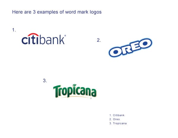
Word mark logos are ideal for new startup businesses because it helps customers familiarize themselves with both the brand name and, ideally, a bit of the brand culture or personality.
3. Letter Mark
Letter mark logos are very similar to word mark logos in that they are created using typefaces; however, there is greater focus on just using first letter, initials, or an abbreviation of a company’s name to convey their brand identity. Unlike word marks that may contain a simple graphic for clarity, letter marks tend to be exclusively typographic.
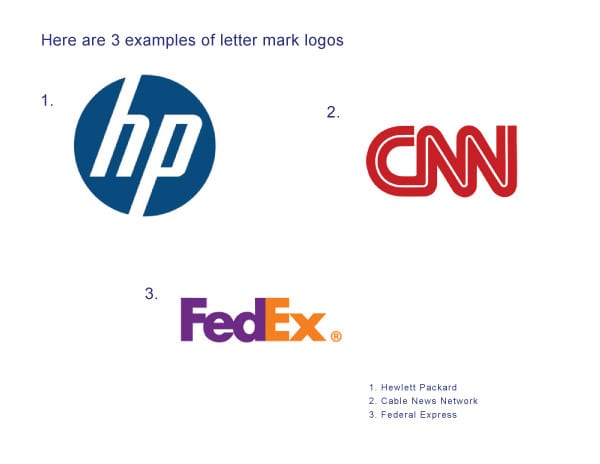
This type of logo is best suited for companies with longer or hard to pronounce names. Companies with names that sound or appear generic can also benefit from letter mark logos as a means of differentiation. As an example, if a friend of yours told you that he was watching a show on “Home Box Office,” you probably wouldn’t have a clue what he was talking about. You may think he was speaking about some new cable network, but “Home Box Office” is none other than the vastly-popular cable channel HBO.
4. Combination Mark
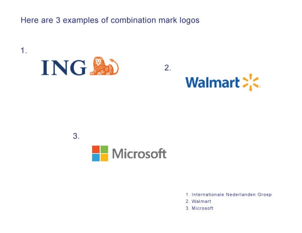
Logos that integrates both a symbol/icon with text (word marks) are known as combination mark logos. According to Tastyplacement.com, 56% of the top 100 companies globally uses this type of logo style. A couple of benefits with developing a combination mark logo for your company are:
- Having both a symbol and a word mark to represent your company gives you an additional level of flexibility on how your brand appears to customers. As your business grows and changes, parts of the mark can be altered, combined, or separated, but always retain a level of consistency. Many businesses today are following this trend.
- Combination mark logos are also easier to register as a trademark than stand alone symbol/icon type logos. Many symbol/icon logos can appear similar without uniquely styled text (word marks) associated with them.
5. Emblem
Emblem logos can be considered combination marks to a degree. They are similar because they both include a symbol and text; however, unlike combination marks, emblem style logos are more integrated and enclosed to appear as one single graphic.
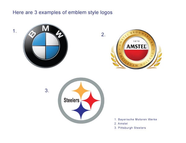
Because of this, emblem style logos cannot be presented as separate identity pieces like a combination mark logo, which gives them very little flexibility, especially in print applications or when resizing. This type of logo is very popular in the automobile industry as well as in the sporting world. Emblem style logos tend to resemble a badge or an official seal.
For the last example I decided to showcase DaBrian Marketing Group. Our logo would be classified as a combination mark because it consists of a word mark, a symbol, and a tagline. This type of logo is ideal for our company because we are a small and only made up of 9 employees. We are not well known outside of our coverage area therefore the combination mark logo serves us best.
Are you looking to design a new logo or take your current one in a new direction? Join the discussion in the comments!
 branding,
Marketing Strategy,
Digital Branding,
word marks,
design,
logos,
combination marks,
symbols,
Logo Design,
letter marks,
brand identity,
icons,
logo types,
emblems
branding,
Marketing Strategy,
Digital Branding,
word marks,
design,
logos,
combination marks,
symbols,
Logo Design,
letter marks,
brand identity,
icons,
logo types,
emblems
Subscribe to our Blog
Recent Posts
Categories
- Marketing Strategy (126)
- web design (82)
- digital marketing (71)
- Search Engine Optimization (SEO) (62)
- Paid Search (PPC) (59)
- Digital Analytics (55)
- seo (51)
- Google Analytics (50)
- News & Events (48)
- Content Marketing (45)
- Social Media Marketing & Management (45)
- PPC (43)
- Ecommerce & Retail Marketing (39)
- Business to Business Marketing (34)
- Mobile marketing (33)
- Website design (32)
- eCommerce (31)
- local seo (30)
- Inbound marketing (29)
- B2B marketing (26)
- social media (26)
- email marketing (25)
- social media marketing (25)
- B2B (24)
- website redesign (23)
- Financial Services (21)
- website development (21)
- Pay Per Click (20)
- SEO strategy (20)
- B2B marketing agency (19)
- marketing (19)
- web development (19)
- Google AdWords (17)
- press release (16)
- Social Media Management (15)
- ecommerce marketing (15)
- marketing automation (15)
- social media strategy (15)
- content (14)
- lead generation (14)
- web design services for small business (14)
- sales (13)
- Digital Branding (12)
- Healthcare & Wellness (12)
- Video Marketing (12)
- Web Design Strategy/Website Strategy (12)
- Web Design Trends (12)
- branding (12)
- search engine optimization (12)
- Analytics (11)
- Artificial intelligence (AI) (11)
- Retail Marketing (11)
- SEM (11)
- digital advertising (11)
- financial services marketing (11)
- increase brand awareness (11)
- internet marketing (11)
- online shopping (11)
- web analytics (11)
- Healthcare Marketing (10)
- Lead Generation Marketing (10)
- SEO Services (10)
- Social Strategy (10)
- financial advisors marketing (10)
- local listing management (10)
- responsive web design (10)
- Bank Marketing (9)
- CRM (9)
- Content Planning (9)
- Google Ads (9)
- Home Services (9)
- Inbound Marketing Strategies (9)
- PPC Marketing (9)
- WordPress (9)
- content development (9)
- content strategy (9)
- 2024 Planning (8)
- B2C Marketing (8)
- Retail Sales (8)
- Shopify (8)
- Web Security (8)
- b2b sales (8)
- financial marketing (8)
- project management (8)
- redesign website (8)
- social marketing (8)
- social media analytics (8)
- strategic marketing (8)
- web designer (8)
- website (8)
- 2025 Planning (7)
- AdWords (7)
- Bing Ads (7)
- Mobile design (7)
- Sales Strategy (7)
- Social Media Metrics (7)
- brand identity (7)
- business strategy (7)
- content optimization (7)
- link building (7)
- mobile (7)
- mobile website (7)
- ppc advertising (7)
- social tips (7)
- AI Content (6)
- CMS (6)
- Customer Persona (6)
- Link Earning (6)
- Online Sales (6)
- ROI (6)
- SEO Agency (6)
- SEO measurement (6)
- Search Engine Marketing (6)
- account-based marketing (6)
- brand development (6)
- digital marketing agency (6)
- digital marketing strategy (6)
- home services marketing (6)
- hubspot cms (6)
- measurement (6)
- news and events (6)
- shopify website (6)
- shopping ads (6)
- small business (6)
- social analytics (6)
- strategy (6)
- Paid Search (5)
- Plumbing Marketing (5)
- brand guidelines (5)
- business to business (5)
- customer relationship management (5)
- customer relationship management tools (5)
- google shopping (5)
- hubspot agency (5)
- inbound marketing strategy (5)
- keyword research (5)
- lead generation website (5)
- marketing insights (5)
- marketing tips (5)
- measuring SEO (5)
- paid search campaigns (5)
- ppc management (5)
- sales CRM (5)
- user experience (5)
- video (5)
- Artificial Intelligence (4)
- CMS Hub (4)
- Call Tracking (4)
- Facebook (4)
- Improve productivity (4)
- Inbound Sales Strategy (4)
- Insurance Marketing (4)
- KPIs (4)
- Local Listings (4)
- Logo Design (4)
- Non-Profit Marketing (4)
- Outbound Sales Strategy (4)
- SERPS (4)
- Uncategorized (4)
- Wealth Management marketing (4)
- compliance (4)
- conversions (4)
- creative design (4)
- credit union (4)
- customer relationship system (4)
- dabrian marketing (4)
- data (4)
- ecommerce SEO (4)
- email (4)
- home improvement (4)
- leads (4)
- mobile advertising (4)
- news (4)
- optimization (4)
- paid online advertising (4)
- sales funnel (4)
- sales pipeline (4)
- security (4)
- smart goals (4)
- social advertising (4)
- tag management (4)
- trends (4)
- web developer (4)
- 2023 (3)
- 2026 planning (3)
- Adobe Analytics (3)
- Amazon Advertising (3)
- Automotive Marketing (3)
- B2B Content (3)
- B2B Search Marketing (3)
- B2B eCommerce (3)
- B2C (3)
- Continuous Website Improvement (3)
- Google My Business (3)
- Growth Driven Design (3)
- HVAC (3)
- Home Improvement Marketing (3)
- Hospital Marketing (3)
- Lawn Care Marketing (3)
- LinkedIn (3)
- Marketing Budgeting (3)
- Measurement Planning (3)
- Multivariate Testing (3)
- Online Business (3)
- Organic Search (3)
- Partnership (3)
- Personas (3)
- Product Inventory (3)
- SEO Reporting (3)
- SOCIAL ECOMMERCE (3)
- Sales Prospecting (3)
- Sales and Marketing Alignment (3)
- Social media updates (3)
- Time Management (3)
- Twitter (3)
- UX Design (3)
- UX research (3)
- adCenter (3)
- advertising (3)
- aeo (3)
- api (3)
- attribution modeling (3)
- bank advertising (3)
- big data (3)
- construction marketing (3)
- consumer services (3)
- customer (3)
- data privacy (3)
- digital content (3)
- digital marketing measurement (3)
- digital marketing services (3)
- email for ecommerce (3)
- facebook ads (3)
- google partners connect (3)
- graphic design (3)
- hubspot (3)
- hubspot crm (3)
- hubspot sales (3)
- instagram (3)
- local search (3)
- manufacturing marketing (3)
- marketing metrics (3)
- minority owned businesses (3)
- monitor (3)
- omnichannel Marketing (3)
- on-page seo (3)
- online reputation management (3)
- online store (3)
- paid search advertising (3)
- pay per click advertising campaigns (3)
- plumbing (3)
- ppc account management (3)
- reputation management (3)
- sales enablement (3)
- social media tips (3)
- tips (3)
- voice search (3)
- #agencylife (2)
- 2022 (2)
- 2023 planning (2)
- 2024 (2)
- ABM (2)
- B2B growth (2)
- BigCommerce (2)
- Business growth opportunities (2)
- COVID (2)
- CRM alignment (2)
- Conversion Tracking (2)
- Covid-19 (2)
- Facebook Tips (2)
- Facebook business (2)
- GDPR (2)
- Gmail tips (2)
- Google Business Profile (2)
- Google event (2)
- Home Improvement Trends (2)
- LinkedIn Ads (2)
- Minority Business Enterprise (2)
- Online Advertising (2)
- Product Data Feed (2)
- Qualitative Data (2)
- Restaurant Marketing (2)
- SBE (2)
- Speed-to-Lead (2)
- Twitter Tips (2)
- UX (2)
- Video SEO (2)
- Yelp (2)
- ad copy (2)
- agency transparency (2)
- algorithm management (2)
- automated bidding (2)
- budget (2)
- business growth (2)
- certification (2)
- client appreciation (2)
- clients (2)
- cloud (2)
- communication (2)
- content promotion (2)
- copywriting (2)
- data driven culture (2)
- data mining (2)
- design (2)
- digital avertising (2)
- digital transformation (2)
- digital vs traditional (2)
- education (2)
- email analytics (2)
- email marketing measurement (2)
- enhanced campaigns (2)
- guide (2)
- healthcare marketing agency (2)
- hootsuite (2)
- hosting services (2)
- implementing (2)
- inbound leads (2)
- inbound success plan (2)
- industries (2)
- industry solutions (2)
- insurance and trust (2)
- interactive content (2)
- internet (2)
- landing (2)
- landing page (2)
- lead generation tools (2)
- lehigh valley (2)
- local business (2)
- local event (2)
- local listing (2)
- logo types (2)
- marketing tools (2)
- measure (2)
- mobile analytics (2)
- mobile app (2)
- mobile optimization (2)
- mobile seo (2)
- multichannel (2)
- multichannel marketing (2)
- native ads (2)
- news release (2)
- non-profit (2)
- nonprofit marketing (2)
- one page web design (2)
- operations process (2)
- outbound marketing (2)
- phone calls (2)
- platform (2)
- rackspace (2)
- reading pa (2)
- remarketing (2)
- retargeting (2)
- sales plan (2)
- segmentation (2)
- self marketing (2)
- social (2)
- social commerce (2)
- social media agency (2)
- staffing and recruitment (2)
- successful (2)
- target audience (2)
- tariffs (2)
- technical seo (2)
- testing (2)
- tracking (2)
- universal analytics (2)
- website optimization (2)
- work platforms (2)
- workflows (2)
- 1 page sales plan (1)
- 2021 (1)
- 2022 planning (1)
- 5 basic principles (1)
- AAF (1)
- AAF-GLV (1)
- ADA Compliance (1)
- Alignment (1)
- American Advertising Federation (1)
- American Advertising Federation Greater Lehigh Val (1)
- AuthorRank (1)
- Backlinks (1)
- Brightlocal (1)
- Business Operations (1)
- Cheap SEO Services (1)
- Cloud U (1)
- Cold Calls (1)
- Cold Email (1)
- Cold Outreach (1)
- Copywriter (1)
- Display Advertising (1)
- Dynamic Text (1)
- First Party Data (1)
- Fractional Marketing (1)
- GK Elite (1)
- General (1)
- Google AI Mode for Healthcare (1)
- Google Guidelines (1)
- Google Marketing Live (1)
- Google Rankbrain (1)
- Google Rankings (1)
- Google reviews (1)
- Google+ (1)
- Growth Strategy (1)
- HIPPA Compliance (1)
- Healthcare AI Search (1)
- Healthcare Automation (1)
- Hospitality & Travel (1)
- Hubspot Onboarding (1)
- Independent Medical Practice (1)
- Independent Medical Practices (1)
- Independent Practice (1)
- Landscaping (1)
- Landscaping Marketing (1)
- Legal advice (1)
- Load-Time (1)
- Logistics (1)
- MBE (1)
- MWBE (1)
- Maintenance Membership (1)
- Manufacturing (1)
- Medial PPC (1)
- Medical Practice SEO (1)
- Microsoft adCenter (1)
- Millennials (1)
- ODYSSEY Battery (1)
- Operational Efficiency (1)
- Pest Control Marketing (1)
- Pipedrive (1)
- Practice Growth (1)
- Programmatic Advertising (1)
- Project Management Systems (1)
- Q4 Healthcare Marketing (1)
- Quality Score (1)
- ROAS (1)
- Recurring Revenue (1)
- Regulation S-P (1)
- SEC Mandate (1)
- SEO strategy in 2015 (1)
- Sales Calls (1)
- Shopify partner (1)
- Shoulder Season (1)
- Soc (1)
- Specialty Practice Marketing (1)
- Toptrends (1)
- URL Structure (1)
- URL tagging (1)
- User Behavior (1)
- VeteransDay (1)
- Woocommerce (1)
- accessibilitiy (1)
- accessibility (1)
- accounts (1)
- administrative (1)
- advisor efficiency (1)
- align (1)
- analytics framework (1)
- artisanal cheese (1)
- attribution (1)
- audience segmentation (1)
- authorship (1)
- auto dealers (1)
- b2b buying habits (1)
- bidding strategy (1)
- blog (1)
- bounce rate (1)
- brand culture (1)
- bug (1)
- business (1)
- business development (1)
- business plan (1)
- business systems (1)
- business tech (1)
- buyer's journey (1)
- buying process (1)
- campaign tagging (1)
- campaign tracking (1)
- candidate marketing (1)
- capturing (1)
- cause marketing (1)
- citations (1)
- click-and-mortar (1)
- column hack (1)
- combination marks (1)
- competitor analysis (1)
- competitor research (1)
- content hub (1)
- content syndication (1)
- conversion (1)
- cost data (1)
- cpa (1)
- cpc (1)
- crowdsourced marketing (1)
- crowdsourcing (1)
- customer segments (1)
- cyber monday (1)
- daa symposium (1)
- data driven marketing (1)
- data security (1)
- dental marketing (1)
- desktop design (1)
- don draper (1)
- downtown improvement district (1)
- efforts (1)
- election (1)
- email campaigns (1)
- email design (1)
- email guidelines (1)
- email organizing tips (1)
- emblems (1)
- emergency search (1)
- engagement (1)
- enterprise search (1)
- event (1)
- event sponsorship (1)
- exact (1)
- expansion (1)
- experiments (1)
- free website (1)
- ga (1)
- geo (1)
- gmail tricks (1)
- google authorship (1)
- greater lehigh valley chamber of commerce (1)
- growth strategies (1)
- heartbleed (1)
- hiring (1)
- hubspot content hub (1)
- hubspot solutions partner (1)
- icons (1)
- increase (1)
- industrial manufacturing (1)
- infographic (1)
- integrated marketing (1)
- integration (1)
- inventory file (1)
- kerning (1)
- keyword match types (1)
- keywords (1)
- law firm (1)
- law firm marketing (1)
- law practice (1)
- legal services (1)
- letter marks (1)
- life science (1)
- local service ads (1)
- logo creation (1)
- logos (1)
- mad men (1)
- maintenance (1)
- marketing attribution (1)
- marketing event (1)
- marketing for law (1)
- marketing hub (1)
- medical marketing (1)
- medical practices (1)
- meetings (1)
- member insights (1)
- metrics (1)
- mobile banking (1)
- multitasking (1)
- myth (1)
- new (1)
- new hire (1)
- new year's resolution (1)
- newhire (1)
- nonprofit (1)
- office (1)
- one page website (1)
- online marketing (1)
- opportunity house (1)
- outdated (1)
- pages (1)
- parallax scrolling (1)
- partner (1)
- personalization (1)
- pharma marketing (1)
- pharmaceutical (1)
- pitfalls (1)
- pivot tables (1)
- predictive marketing (1)
- privacy (1)
- problem planning (1)
- product feed (1)
- productivity (1)
- project manager (1)
- project mgmt system (1)
- projects (1)
- prospects (1)
- quality (1)
- rank higher (1)
- recruiting (1)
- regulated (1)
- relations (1)
- remote workspace (1)
- return on ad spend (1)
- reviews (1)
- rich snippets (1)
- robo advisors (1)
- sales automation (1)
- sales enablement tools (1)
- sales goals (1)
- say cheese reopening (1)
- schema markup (1)
- search engines (1)
- search intent (1)
- search rankings (1)
- seocial (1)
- sequences (1)
- single page website (1)
- snap map (1)
- snapchat (1)
- snapchat business (1)
- snapchat tips (1)
- social media marketing agencies (1)
- social media tools (1)
- social monitoring (1)
- socialytics (1)
- storytelling (1)
- superiors (1)
- supply chain (1)
- symbols (1)
- tag management solution (1)
- tagline development (1)
- task management (1)
- team (1)
- thankyouforyourservice (1)
- time blocking (1)
- traditional marketing (1)
- tutorial (1)
- twitter business (1)
- user experience research (1)
- video production (1)
- video strategy (1)
- virtual reality (1)
- visibility (1)
- volunteerism (1)
- webinar (1)
- website updates (1)
- white paper (1)
- word marks (1)
- work from home (1)
- work tools (1)
- yahoo mail (1)
Archives
- April 2025 (8)
- July 2025 (8)
- December 2025 (8)
- September 2012 (7)
- May 2026 (7)
- August 2015 (6)
- February 2016 (6)
- July 2016 (6)
- January 2017 (6)
- May 2017 (6)
- June 2025 (6)
- October 2025 (6)
- June 2026 (6)
- May 2012 (5)
- April 2013 (5)
- May 2013 (5)
- June 2013 (5)
- July 2013 (5)
- July 2014 (5)
- October 2014 (5)
- January 2015 (5)
- July 2015 (5)
- October 2015 (5)
- May 2016 (5)
- June 2016 (5)
- October 2016 (5)
- March 2017 (5)
- April 2017 (5)
- April 2022 (5)
- May 2022 (5)
- June 2022 (5)
- November 2022 (5)
- February 2024 (5)
- July 2024 (5)
- October 2024 (5)
- March 2025 (5)
- September 2025 (5)
- November 2025 (5)
- March 2026 (5)
- April 2026 (5)
- June 2011 (4)
- April 2012 (4)
- June 2012 (4)
- July 2012 (4)
- August 2012 (4)
- October 2012 (4)
- November 2012 (4)
- January 2013 (4)
- February 2013 (4)
- September 2013 (4)
- October 2013 (4)
- March 2014 (4)
- June 2014 (4)
- August 2014 (4)
- September 2014 (4)
- November 2014 (4)
- March 2015 (4)
- May 2015 (4)
- June 2015 (4)
- January 2016 (4)
- August 2016 (4)
- September 2016 (4)
- November 2016 (4)
- December 2016 (4)
- June 2017 (4)
- March 2018 (4)
- December 2018 (4)
- May 2019 (4)
- January 2021 (4)
- April 2021 (4)
- October 2021 (4)
- December 2021 (4)
- January 2022 (4)
- February 2022 (4)
- March 2022 (4)
- July 2022 (4)
- September 2022 (4)
- February 2023 (4)
- July 2023 (4)
- August 2023 (4)
- October 2023 (4)
- December 2023 (4)
- April 2024 (4)
- May 2024 (4)
- August 2024 (4)
- February 2025 (4)
- January 2026 (4)
- February 2026 (4)
- January 2012 (3)
- December 2012 (3)
- March 2013 (3)
- August 2013 (3)
- November 2013 (3)
- February 2014 (3)
- April 2014 (3)
- May 2014 (3)
- December 2014 (3)
- February 2015 (3)
- April 2015 (3)
- September 2015 (3)
- November 2015 (3)
- December 2015 (3)
- March 2016 (3)
- April 2016 (3)
- August 2017 (3)
- October 2017 (3)
- October 2018 (3)
- January 2019 (3)
- February 2019 (3)
- October 2019 (3)
- February 2020 (3)
- August 2020 (3)
- October 2020 (3)
- November 2020 (3)
- December 2020 (3)
- March 2021 (3)
- July 2021 (3)
- August 2021 (3)
- September 2021 (3)
- August 2022 (3)
- December 2022 (3)
- January 2023 (3)
- March 2023 (3)
- April 2023 (3)
- May 2023 (3)
- January 2024 (3)
- March 2024 (3)
- June 2024 (3)
- September 2024 (3)
- November 2024 (3)
- January 2025 (3)
- August 2025 (3)
- July 2011 (2)
- September 2011 (2)
- November 2011 (2)
- February 2012 (2)
- December 2013 (2)
- February 2017 (2)
- July 2017 (2)
- September 2017 (2)
- May 2018 (2)
- August 2018 (2)
- September 2018 (2)
- March 2019 (2)
- December 2019 (2)
- March 2020 (2)
- July 2020 (2)
- February 2021 (2)
- May 2021 (2)
- June 2021 (2)
- October 2022 (2)
- June 2023 (2)
- September 2023 (2)
- November 2023 (2)
- May 2025 (2)
- March 2010 (1)
- May 2011 (1)
- August 2011 (1)
- October 2011 (1)
- December 2011 (1)
- March 2012 (1)
- January 2014 (1)
- January 2018 (1)
- April 2018 (1)
- June 2018 (1)
- July 2018 (1)
- November 2018 (1)
- April 2019 (1)
- July 2019 (1)
- November 2019 (1)
- January 2020 (1)
- September 2020 (1)
- November 2021 (1)
- December 2024 (1)
- July 2026 (1)