416 Blair Ave,
Reading, PA 19601
![]()
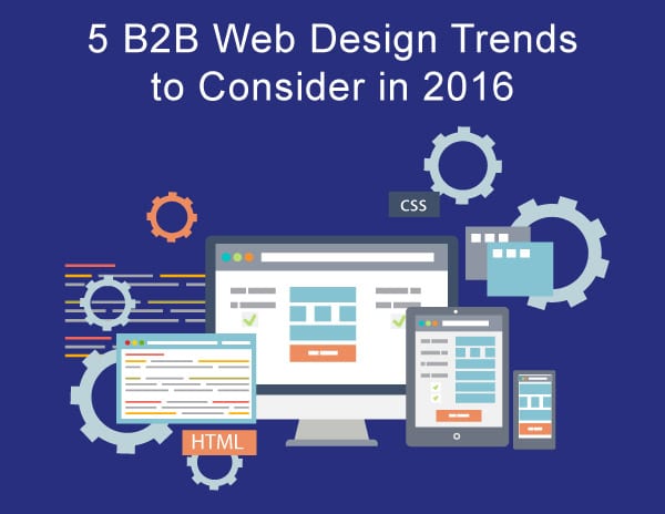
5 B2B Web Design Trends to Consider in 2016
Introduction:
Back in March 2015 I wrote a blog which covered “Five New Web Design Trends for 2015”. Although several of these trends have managed to survive 2015, there are some additional trends that could affect the usability of your B2B website. In this blog, I will go over five (5) additional trends that can help improve usability, increase website traffic, and help drive conversions.
1. More Unique & Creative Typography
With the emergence of affordable or free web-safe fonts options like Google Fonts and Adobe Typekit, typography is becoming much more unique, and creative. On many B2B websites, headers are becoming much bolder and body text is appearing much larger in size. In addition to latest evolution of the Cascading Style Sheets language, CSS3, styling typography will offer unlimited options on how it’s presented on the web going forward. Sites like StephenCraver utilizes great use of typography to carry the layout of the site.
According to HTTP Archive, the use of custom fonts has increased over the past year. Bolder, more unique typefaces will continue to be used in B2B web design going forward. While designers may still play it safe when it comes to choosing fonts for readable type and body copy, expect to see more unique and experimental font being used for website headers and supporting text.
2. Cards, Cards, and Even More Cards
As you browse the web, you may notice that many B2B companies are leaning more towards a card design look. This web design trend is most common on social media platforms, and most commonly associated with Pinterest, however many companies have adapted this trend and you should see more of it in 2016. Several other notable sites utilizing this trend are ESPN, Dribble, The Guardian, and Amazon.
3. Less Photography, More Illustrations
Before 2016, they were plenty of B2B websites that were overloaded with stock images as means of telling their brand story. If the appropriate images aren’t chosen, this direction could cause a big disconnect between your business and potential clients. In 2016, you will notice that many businesses will move away from stock photography (especially if they are not personable) and rely more on illustration graphics to tell their story.
You will find illustration being implemented in a variety of ways such as, large-scale, hero images and backgrounds, or on much smaller scales such as icons and user interface elements. Two nice examples of websites utilizing illustrations as it’s main source of graphics are McWhopper and Ice & Sky which combine large background illustrations and animation to tell their brand story.
4. Bolder use of color
In 2015, B2B companies who implemented flat design into their website more than likely utilized a color palette which was just a flat as the design itself. With that being said, 2016 promises to be much more colorful than years past.
Color has always been one of the most single important tools for expressing a company’s brand story or message. In prior years, many B2B companies stuck to “web-safe” palettes because of the some technology limitations. If you are looking for color inspiration websites like Adobe Color CC, Paletton, Coolors can help you put together some interesting color palettes. A couple examples of good color implementation on their websites are Bose and History Of Icons.
5. Keep On Scrolling and Less Reloading
To scroll, or not to scroll. This has always been a highly debatable topic for many. It seems that more people are finding it easier to scroll down a page rather than clicking, and loading another page. This is more relevant to smartphones users browsing on slow or limited data networks. Whether on mobile or desktop, scrolling can be a very effective way of telling a company’s brand story. If your B2B website is accustom to getting a high volume of mobile traffic, scrolling would be a much better user experience than a page refresh on any device.
Websites using a Parallax scrolling effect are often implemented as a way to tell a story and make layouts more dynamically appealing. Scrolling allows the content to be incrementally readable, allowing more options and visibility to other Micro Interactions. One of my favorite scrolling or parallax designs is the Lexus website. This website implements an excellent one-page design with sections that lead to other Call To Actions (CTAs) or micro interactions.
Conclusion
While it may not be necessary to implement every new trend into your website, many of them have the potential to improve user experience. Before following new trends, it is best that you have some knowledge of what they are and how they can affect your business. Once you have a strategy in place, implementing new trends and having the ability to test them will help you streamline that process. This will help you adapt to a trend that best reflects you and your business goals.
 marketing,
trends,
Marketing Strategy,
Business to Business Marketing,
B2B,
web design,
Mobile marketing
marketing,
trends,
Marketing Strategy,
Business to Business Marketing,
B2B,
web design,
Mobile marketing
Subscribe to our Blog
Recent Posts
Categories
- Marketing Strategy (126)
- web design (82)
- digital marketing (71)
- Search Engine Optimization (SEO) (62)
- Paid Search (PPC) (59)
- Digital Analytics (55)
- seo (51)
- Google Analytics (50)
- News & Events (48)
- Social Media Marketing & Management (46)
- Content Marketing (45)
- PPC (43)
- Ecommerce & Retail Marketing (39)
- Business to Business Marketing (34)
- Mobile marketing (33)
- Website design (32)
- eCommerce (31)
- local seo (30)
- Inbound marketing (29)
- B2B marketing (26)
- social media (26)
- email marketing (25)
- social media marketing (25)
- B2B (24)
- website redesign (23)
- Financial Services (22)
- website development (21)
- Pay Per Click (20)
- SEO strategy (20)
- B2B marketing agency (19)
- marketing (19)
- web development (19)
- Google AdWords (17)
- press release (16)
- Social Media Management (15)
- ecommerce marketing (15)
- marketing automation (15)
- social media strategy (15)
- content (14)
- lead generation (14)
- web design services for small business (14)
- sales (13)
- Digital Branding (12)
- Healthcare & Wellness (12)
- Video Marketing (12)
- Web Design Strategy/Website Strategy (12)
- Web Design Trends (12)
- branding (12)
- search engine optimization (12)
- Analytics (11)
- Artificial intelligence (AI) (11)
- Retail Marketing (11)
- SEM (11)
- Social Strategy (11)
- digital advertising (11)
- financial services marketing (11)
- increase brand awareness (11)
- internet marketing (11)
- online shopping (11)
- web analytics (11)
- Healthcare Marketing (10)
- Lead Generation Marketing (10)
- SEO Services (10)
- financial advisors marketing (10)
- local listing management (10)
- responsive web design (10)
- Bank Marketing (9)
- CRM (9)
- Content Planning (9)
- Google Ads (9)
- Home Services (9)
- Inbound Marketing Strategies (9)
- PPC Marketing (9)
- WordPress (9)
- content development (9)
- content strategy (9)
- 2024 Planning (8)
- B2C Marketing (8)
- Retail Sales (8)
- Shopify (8)
- Web Security (8)
- b2b sales (8)
- financial marketing (8)
- project management (8)
- redesign website (8)
- social marketing (8)
- social media analytics (8)
- strategic marketing (8)
- web designer (8)
- website (8)
- 2025 Planning (7)
- AdWords (7)
- Bing Ads (7)
- Mobile design (7)
- Sales Strategy (7)
- Social Media Metrics (7)
- brand identity (7)
- business strategy (7)
- content optimization (7)
- link building (7)
- mobile (7)
- mobile website (7)
- ppc advertising (7)
- social tips (7)
- AI Content (6)
- CMS (6)
- Customer Persona (6)
- Link Earning (6)
- Online Sales (6)
- ROI (6)
- SEO Agency (6)
- SEO measurement (6)
- Search Engine Marketing (6)
- account-based marketing (6)
- brand development (6)
- digital marketing agency (6)
- digital marketing strategy (6)
- home services marketing (6)
- hubspot cms (6)
- measurement (6)
- news and events (6)
- shopify website (6)
- shopping ads (6)
- small business (6)
- social analytics (6)
- strategy (6)
- Paid Search (5)
- Plumbing Marketing (5)
- brand guidelines (5)
- business to business (5)
- customer relationship management (5)
- customer relationship management tools (5)
- google shopping (5)
- hubspot agency (5)
- inbound marketing strategy (5)
- keyword research (5)
- lead generation website (5)
- marketing insights (5)
- marketing tips (5)
- measuring SEO (5)
- paid search campaigns (5)
- ppc management (5)
- sales CRM (5)
- user experience (5)
- video (5)
- Artificial Intelligence (4)
- CMS Hub (4)
- Call Tracking (4)
- Facebook (4)
- Improve productivity (4)
- Inbound Sales Strategy (4)
- Insurance Marketing (4)
- KPIs (4)
- Local Listings (4)
- Logo Design (4)
- Non-Profit Marketing (4)
- Outbound Sales Strategy (4)
- SERPS (4)
- Uncategorized (4)
- Wealth Management marketing (4)
- compliance (4)
- conversions (4)
- creative design (4)
- credit union (4)
- customer relationship system (4)
- dabrian marketing (4)
- data (4)
- ecommerce SEO (4)
- email (4)
- home improvement (4)
- leads (4)
- mobile advertising (4)
- news (4)
- optimization (4)
- paid online advertising (4)
- sales funnel (4)
- sales pipeline (4)
- security (4)
- smart goals (4)
- social advertising (4)
- social media tips (4)
- tag management (4)
- trends (4)
- web developer (4)
- 2023 (3)
- 2026 planning (3)
- Adobe Analytics (3)
- Amazon Advertising (3)
- Automotive Marketing (3)
- B2B Content (3)
- B2B Search Marketing (3)
- B2B eCommerce (3)
- B2C (3)
- Continuous Website Improvement (3)
- Google My Business (3)
- Growth Driven Design (3)
- HVAC (3)
- Home Improvement Marketing (3)
- Hospital Marketing (3)
- Lawn Care Marketing (3)
- LinkedIn (3)
- Marketing Budgeting (3)
- Measurement Planning (3)
- Multivariate Testing (3)
- Online Business (3)
- Organic Search (3)
- Partnership (3)
- Personas (3)
- Product Inventory (3)
- SEO Reporting (3)
- SOCIAL ECOMMERCE (3)
- Sales Prospecting (3)
- Sales and Marketing Alignment (3)
- Social media updates (3)
- Time Management (3)
- Twitter (3)
- UX Design (3)
- UX research (3)
- adCenter (3)
- advertising (3)
- aeo (3)
- api (3)
- attribution modeling (3)
- bank advertising (3)
- big data (3)
- construction marketing (3)
- consumer services (3)
- customer (3)
- data privacy (3)
- digital content (3)
- digital marketing measurement (3)
- digital marketing services (3)
- email for ecommerce (3)
- facebook ads (3)
- google partners connect (3)
- graphic design (3)
- hubspot (3)
- hubspot crm (3)
- hubspot sales (3)
- instagram (3)
- local search (3)
- manufacturing marketing (3)
- marketing metrics (3)
- minority owned businesses (3)
- monitor (3)
- omnichannel Marketing (3)
- on-page seo (3)
- online reputation management (3)
- online store (3)
- paid search advertising (3)
- pay per click advertising campaigns (3)
- plumbing (3)
- ppc account management (3)
- reputation management (3)
- sales enablement (3)
- tips (3)
- voice search (3)
- #agencylife (2)
- 2022 (2)
- 2023 planning (2)
- 2024 (2)
- ABM (2)
- B2B growth (2)
- BigCommerce (2)
- Business growth opportunities (2)
- COVID (2)
- CRM alignment (2)
- Conversion Tracking (2)
- Covid-19 (2)
- Facebook Tips (2)
- Facebook business (2)
- GDPR (2)
- Gmail tips (2)
- Google Business Profile (2)
- Google event (2)
- Home Improvement Trends (2)
- LinkedIn Ads (2)
- Minority Business Enterprise (2)
- Online Advertising (2)
- Product Data Feed (2)
- Qualitative Data (2)
- Restaurant Marketing (2)
- SBE (2)
- Speed-to-Lead (2)
- Twitter Tips (2)
- UX (2)
- Video SEO (2)
- Yelp (2)
- ad copy (2)
- agency transparency (2)
- algorithm management (2)
- automated bidding (2)
- budget (2)
- business growth (2)
- certification (2)
- client appreciation (2)
- clients (2)
- cloud (2)
- communication (2)
- content promotion (2)
- copywriting (2)
- data driven culture (2)
- data mining (2)
- design (2)
- digital avertising (2)
- digital transformation (2)
- digital vs traditional (2)
- education (2)
- email analytics (2)
- email marketing measurement (2)
- enhanced campaigns (2)
- guide (2)
- healthcare marketing agency (2)
- hootsuite (2)
- hosting services (2)
- implementing (2)
- inbound leads (2)
- inbound success plan (2)
- industries (2)
- industry solutions (2)
- insurance and trust (2)
- interactive content (2)
- internet (2)
- landing (2)
- landing page (2)
- lead generation tools (2)
- lehigh valley (2)
- local business (2)
- local event (2)
- local listing (2)
- logo types (2)
- marketing tools (2)
- measure (2)
- mobile analytics (2)
- mobile app (2)
- mobile optimization (2)
- mobile seo (2)
- multichannel (2)
- multichannel marketing (2)
- native ads (2)
- news release (2)
- non-profit (2)
- nonprofit marketing (2)
- one page web design (2)
- operations process (2)
- outbound marketing (2)
- phone calls (2)
- platform (2)
- rackspace (2)
- reading pa (2)
- remarketing (2)
- retargeting (2)
- sales plan (2)
- segmentation (2)
- self marketing (2)
- social (2)
- social commerce (2)
- social media agency (2)
- staffing and recruitment (2)
- successful (2)
- target audience (2)
- tariffs (2)
- technical seo (2)
- testing (2)
- tracking (2)
- universal analytics (2)
- website optimization (2)
- work platforms (2)
- workflows (2)
- 1 page sales plan (1)
- 2021 (1)
- 2022 planning (1)
- 5 basic principles (1)
- AAF (1)
- AAF-GLV (1)
- ADA Compliance (1)
- Alignment (1)
- American Advertising Federation (1)
- American Advertising Federation Greater Lehigh Val (1)
- AuthorRank (1)
- Backlinks (1)
- Bank Lead Generation (1)
- Brightlocal (1)
- Business Operations (1)
- Cheap SEO Services (1)
- Cloud U (1)
- Cold Calls (1)
- Cold Email (1)
- Cold Outreach (1)
- Copywriter (1)
- Display Advertising (1)
- Dynamic Text (1)
- Employee Advocacy (1)
- Financial SEO (1)
- First Party Data (1)
- Fractional Marketing (1)
- GK Elite (1)
- General (1)
- Google AI Mode for Healthcare (1)
- Google Guidelines (1)
- Google Marketing Live (1)
- Google Rankbrain (1)
- Google Rankings (1)
- Google reviews (1)
- Google+ (1)
- Growth Strategy (1)
- HIPPA Compliance (1)
- Healthcare AI Search (1)
- Healthcare Automation (1)
- Hospitality & Travel (1)
- Hubspot Onboarding (1)
- Independent Medical Practice (1)
- Independent Medical Practices (1)
- Independent Practice (1)
- Landscaping (1)
- Landscaping Marketing (1)
- Legal advice (1)
- Load-Time (1)
- Logistics (1)
- MBE (1)
- MWBE (1)
- Maintenance Membership (1)
- Manufacturing (1)
- Medial PPC (1)
- Medical Practice SEO (1)
- Microsoft adCenter (1)
- Millennials (1)
- ODYSSEY Battery (1)
- Operational Efficiency (1)
- Pest Control Marketing (1)
- Pipedrive (1)
- Practice Growth (1)
- Programmatic Advertising (1)
- Project Management Systems (1)
- Q4 Healthcare Marketing (1)
- Quality Score (1)
- ROAS (1)
- Recurring Revenue (1)
- Regulation S-P (1)
- SEC Mandate (1)
- SEO strategy in 2015 (1)
- Sales Calls (1)
- Shopify partner (1)
- Shoulder Season (1)
- Soc (1)
- Specialty Practice Marketing (1)
- Toptrends (1)
- URL Structure (1)
- URL tagging (1)
- User Behavior (1)
- VeteransDay (1)
- Wealth Management (1)
- Woocommerce (1)
- accessibilitiy (1)
- accessibility (1)
- accounts (1)
- administrative (1)
- advisor efficiency (1)
- align (1)
- analytics framework (1)
- artisanal cheese (1)
- attribution (1)
- audience segmentation (1)
- authorship (1)
- auto dealers (1)
- b2b buying habits (1)
- bidding strategy (1)
- blog (1)
- bounce rate (1)
- brand culture (1)
- bug (1)
- business (1)
- business development (1)
- business plan (1)
- business systems (1)
- business tech (1)
- buyer's journey (1)
- buying process (1)
- campaign tagging (1)
- campaign tracking (1)
- candidate marketing (1)
- capturing (1)
- cause marketing (1)
- citations (1)
- click-and-mortar (1)
- column hack (1)
- combination marks (1)
- competitor analysis (1)
- competitor research (1)
- content hub (1)
- content syndication (1)
- conversion (1)
- cost data (1)
- cpa (1)
- cpc (1)
- crowdsourced marketing (1)
- crowdsourcing (1)
- customer segments (1)
- cyber monday (1)
- daa symposium (1)
- data driven marketing (1)
- data security (1)
- dental marketing (1)
- desktop design (1)
- don draper (1)
- downtown improvement district (1)
- efforts (1)
- election (1)
- email campaigns (1)
- email design (1)
- email guidelines (1)
- email organizing tips (1)
- emblems (1)
- emergency search (1)
- engagement (1)
- enterprise search (1)
- event (1)
- event sponsorship (1)
- exact (1)
- expansion (1)
- experiments (1)
- free website (1)
- ga (1)
- geo (1)
- gmail tricks (1)
- google authorship (1)
- greater lehigh valley chamber of commerce (1)
- growth strategies (1)
- heartbleed (1)
- hiring (1)
- hubspot content hub (1)
- hubspot solutions partner (1)
- icons (1)
- increase (1)
- industrial manufacturing (1)
- infographic (1)
- integrated marketing (1)
- integration (1)
- inventory file (1)
- kerning (1)
- keyword match types (1)
- keywords (1)
- law firm (1)
- law firm marketing (1)
- law practice (1)
- legal services (1)
- letter marks (1)
- life science (1)
- local service ads (1)
- logo creation (1)
- logos (1)
- mad men (1)
- maintenance (1)
- marketing attribution (1)
- marketing event (1)
- marketing for law (1)
- marketing hub (1)
- medical marketing (1)
- medical practices (1)
- meetings (1)
- member insights (1)
- metrics (1)
- mobile banking (1)
- multitasking (1)
- myth (1)
- new (1)
- new hire (1)
- new year's resolution (1)
- newhire (1)
- nonprofit (1)
- office (1)
- one page website (1)
- online marketing (1)
- opportunity house (1)
- outdated (1)
- pages (1)
- parallax scrolling (1)
- partner (1)
- personalization (1)
- pharma marketing (1)
- pharmaceutical (1)
- pitfalls (1)
- pivot tables (1)
- predictive marketing (1)
- privacy (1)
- problem planning (1)
- product feed (1)
- productivity (1)
- project manager (1)
- project mgmt system (1)
- projects (1)
- prospects (1)
- quality (1)
- rank higher (1)
- recruiting (1)
- regulated (1)
- relations (1)
- remote workspace (1)
- return on ad spend (1)
- reviews (1)
- rich snippets (1)
- robo advisors (1)
- sales automation (1)
- sales enablement tools (1)
- sales goals (1)
- say cheese reopening (1)
- schema markup (1)
- search engines (1)
- search intent (1)
- search rankings (1)
- seocial (1)
- sequences (1)
- single page website (1)
- snap map (1)
- snapchat (1)
- snapchat business (1)
- snapchat tips (1)
- social media marketing agencies (1)
- social media tools (1)
- social monitoring (1)
- socialytics (1)
- storytelling (1)
- superiors (1)
- supply chain (1)
- symbols (1)
- tag management solution (1)
- tagline development (1)
- task management (1)
- team (1)
- thankyouforyourservice (1)
- time blocking (1)
- traditional marketing (1)
- tutorial (1)
- twitter business (1)
- user experience research (1)
- video production (1)
- video strategy (1)
- virtual reality (1)
- visibility (1)
- volunteerism (1)
- webinar (1)
- website updates (1)
- white paper (1)
- word marks (1)
- work from home (1)
- work tools (1)
- yahoo mail (1)
Archives
- April 2025 (8)
- July 2025 (8)
- December 2025 (8)
- September 2012 (7)
- May 2026 (7)
- August 2015 (6)
- February 2016 (6)
- July 2016 (6)
- January 2017 (6)
- May 2017 (6)
- June 2025 (6)
- October 2025 (6)
- June 2026 (6)
- May 2012 (5)
- April 2013 (5)
- May 2013 (5)
- June 2013 (5)
- July 2013 (5)
- July 2014 (5)
- October 2014 (5)
- January 2015 (5)
- July 2015 (5)
- October 2015 (5)
- May 2016 (5)
- June 2016 (5)
- October 2016 (5)
- March 2017 (5)
- April 2017 (5)
- April 2022 (5)
- May 2022 (5)
- June 2022 (5)
- November 2022 (5)
- February 2024 (5)
- July 2024 (5)
- October 2024 (5)
- March 2025 (5)
- September 2025 (5)
- November 2025 (5)
- March 2026 (5)
- April 2026 (5)
- June 2011 (4)
- April 2012 (4)
- June 2012 (4)
- July 2012 (4)
- August 2012 (4)
- October 2012 (4)
- November 2012 (4)
- January 2013 (4)
- February 2013 (4)
- September 2013 (4)
- October 2013 (4)
- March 2014 (4)
- June 2014 (4)
- August 2014 (4)
- September 2014 (4)
- November 2014 (4)
- March 2015 (4)
- May 2015 (4)
- June 2015 (4)
- January 2016 (4)
- August 2016 (4)
- September 2016 (4)
- November 2016 (4)
- December 2016 (4)
- June 2017 (4)
- March 2018 (4)
- December 2018 (4)
- May 2019 (4)
- January 2021 (4)
- April 2021 (4)
- October 2021 (4)
- December 2021 (4)
- January 2022 (4)
- February 2022 (4)
- March 2022 (4)
- July 2022 (4)
- September 2022 (4)
- February 2023 (4)
- July 2023 (4)
- August 2023 (4)
- October 2023 (4)
- December 2023 (4)
- April 2024 (4)
- May 2024 (4)
- August 2024 (4)
- February 2025 (4)
- January 2026 (4)
- February 2026 (4)
- July 2026 (4)
- January 2012 (3)
- December 2012 (3)
- March 2013 (3)
- August 2013 (3)
- November 2013 (3)
- February 2014 (3)
- April 2014 (3)
- May 2014 (3)
- December 2014 (3)
- February 2015 (3)
- April 2015 (3)
- September 2015 (3)
- November 2015 (3)
- December 2015 (3)
- March 2016 (3)
- April 2016 (3)
- August 2017 (3)
- October 2017 (3)
- October 2018 (3)
- January 2019 (3)
- February 2019 (3)
- October 2019 (3)
- February 2020 (3)
- August 2020 (3)
- October 2020 (3)
- November 2020 (3)
- December 2020 (3)
- March 2021 (3)
- July 2021 (3)
- August 2021 (3)
- September 2021 (3)
- August 2022 (3)
- December 2022 (3)
- January 2023 (3)
- March 2023 (3)
- April 2023 (3)
- May 2023 (3)
- January 2024 (3)
- March 2024 (3)
- June 2024 (3)
- September 2024 (3)
- November 2024 (3)
- January 2025 (3)
- August 2025 (3)
- July 2011 (2)
- September 2011 (2)
- November 2011 (2)
- February 2012 (2)
- December 2013 (2)
- February 2017 (2)
- July 2017 (2)
- September 2017 (2)
- May 2018 (2)
- August 2018 (2)
- September 2018 (2)
- March 2019 (2)
- December 2019 (2)
- March 2020 (2)
- July 2020 (2)
- February 2021 (2)
- May 2021 (2)
- June 2021 (2)
- October 2022 (2)
- June 2023 (2)
- September 2023 (2)
- November 2023 (2)
- May 2025 (2)
- March 2010 (1)
- May 2011 (1)
- August 2011 (1)
- October 2011 (1)
- December 2011 (1)
- March 2012 (1)
- January 2014 (1)
- January 2018 (1)
- April 2018 (1)
- June 2018 (1)
- July 2018 (1)
- November 2018 (1)
- April 2019 (1)
- July 2019 (1)
- November 2019 (1)
- January 2020 (1)
- September 2020 (1)
- November 2021 (1)
- December 2024 (1)