416 Blair Ave,
Reading, PA 19601
![]()
5 Best Practices for Better B2B Website User Experience
It’s generally a good idea to start your web design project using best practices, especially if you haven’t accumulated any data to support a specific design change, or direction. Remember that you shouldn’t end your design solely implementing best practice solutions; however, you should use the data feedback, by use of analytics, to optimize and improve user experience. Here are five effective best practices for B2B Businesses that can help you get started with better, more efficient website.
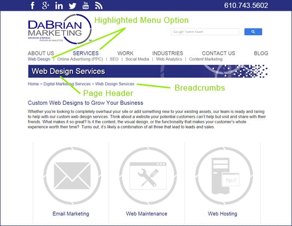
1. Make Your Navigation and Visitors Location on the Site Highly Visible
Users should know where they were, and where they are on your site. This can be accomplished using elements like breadcrumbs, page-headers, highlighted menu options, progress bars, thank you and confirmation pages. Not using these elements can cause an unhappy user experience when they try to navigate deeper into your website or try to navigate through a purchasing process. Always remember that creating a smooth and comfortable user experience is your ultimate goal when designing your B2B website.
2. Match Your Content to Real World Language by Eliminating Jargon
The language used on B2B websites should be familiar to the visitor rather than using industry specific terms or jargon. Using jargon, or language that is too technical to comprehend can create a disconnect with the visitor. To find out what words and phrases your website visitors are using it’s best to do a little keyword research. This will help you define how you go after potential customers or leads using language they are comfortable with.
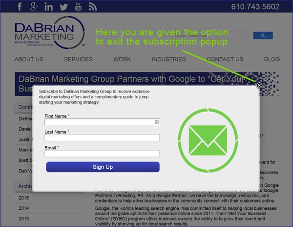
3. Allow Total User Control and Freedom From Automated Processes
Simply put, eliminate anything that takes control out of the user’s hands. If not implemented correctly, elements such as popups, auto-play videos, and automatic carousels can cause lack of user control and freedom, hence creating a bad user experience. If the user doesn’t want to subscribe to a newsletter popup, or watch a demo video they should have a way of exiting or navigating away from that element without any complications.
4. Create Your B2B Website Using a Minimalistic Design Approach
For the past several years, taking a minimalist approach seems to be the most effective way to create a B2B website. In a study conducted by Google, it was scientifically proven that minimalist design are more appealing to buyers. In addition, an effective use of white space can clearly guide buyers to the important sections of information. Cluttered websites don’t effectively allow this to happen and that’s why it is best to focus on the important information visitors are looking for.
5. Offer Solutions and Help Documentation
If designed correctly, your website shouldn’t need much of this best practice solution. However, offering help solutions is a big plus. Help solutions such as live chat pop-ups, FAQ’s, pricing tables, and microcopy, which are little words or phrases that enhance the subscription or buying process that helps to reduce friction and get people taking action. Usually, if you submit a form without the required information being entered, you may receive a prompt in the form of microcopy letting you know that the information for that field is needed to submit the form request.
Conclusion
Whether you are creating a new website, redesigning, or just optimizing an existing one, utilizing best practices will offer a great peace of mind. Although the best practices mentioned aren’t actual principles or laws of web design, they provide a good starting point in most cases. Also, remember that these best practices are backed by data which support their effectiveness.
What other B2B website best practices do you recommend not mentioned in the blog? Please provide your comments below.

Subscribe to our Blog
Recent Posts
Categories
- Marketing Strategy (126)
- web design (82)
- digital marketing (71)
- Search Engine Optimization (SEO) (62)
- Paid Search (PPC) (59)
- Digital Analytics (55)
- seo (51)
- Google Analytics (50)
- News & Events (48)
- Social Media Marketing & Management (46)
- Content Marketing (45)
- PPC (43)
- Ecommerce & Retail Marketing (39)
- Business to Business Marketing (34)
- Mobile marketing (33)
- Website design (32)
- eCommerce (31)
- local seo (30)
- Inbound marketing (29)
- B2B marketing (26)
- social media (26)
- email marketing (25)
- social media marketing (25)
- B2B (24)
- website redesign (23)
- Financial Services (22)
- website development (21)
- Pay Per Click (20)
- SEO strategy (20)
- B2B marketing agency (19)
- marketing (19)
- web development (19)
- Google AdWords (17)
- press release (16)
- Social Media Management (15)
- ecommerce marketing (15)
- marketing automation (15)
- social media strategy (15)
- content (14)
- lead generation (14)
- web design services for small business (14)
- sales (13)
- Digital Branding (12)
- Healthcare & Wellness (12)
- Video Marketing (12)
- Web Design Strategy/Website Strategy (12)
- Web Design Trends (12)
- branding (12)
- search engine optimization (12)
- Analytics (11)
- Artificial intelligence (AI) (11)
- Retail Marketing (11)
- SEM (11)
- Social Strategy (11)
- digital advertising (11)
- financial services marketing (11)
- increase brand awareness (11)
- internet marketing (11)
- online shopping (11)
- web analytics (11)
- Healthcare Marketing (10)
- Lead Generation Marketing (10)
- SEO Services (10)
- financial advisors marketing (10)
- local listing management (10)
- responsive web design (10)
- Bank Marketing (9)
- CRM (9)
- Content Planning (9)
- Google Ads (9)
- Home Services (9)
- Inbound Marketing Strategies (9)
- PPC Marketing (9)
- WordPress (9)
- content development (9)
- content strategy (9)
- 2024 Planning (8)
- B2C Marketing (8)
- Retail Sales (8)
- Shopify (8)
- Web Security (8)
- b2b sales (8)
- financial marketing (8)
- project management (8)
- redesign website (8)
- social marketing (8)
- social media analytics (8)
- strategic marketing (8)
- web designer (8)
- website (8)
- 2025 Planning (7)
- AdWords (7)
- Bing Ads (7)
- Mobile design (7)
- Sales Strategy (7)
- Social Media Metrics (7)
- brand identity (7)
- business strategy (7)
- content optimization (7)
- link building (7)
- mobile (7)
- mobile website (7)
- ppc advertising (7)
- social tips (7)
- AI Content (6)
- CMS (6)
- Customer Persona (6)
- Link Earning (6)
- Online Sales (6)
- ROI (6)
- SEO Agency (6)
- SEO measurement (6)
- Search Engine Marketing (6)
- account-based marketing (6)
- brand development (6)
- digital marketing agency (6)
- digital marketing strategy (6)
- home services marketing (6)
- hubspot cms (6)
- measurement (6)
- news and events (6)
- shopify website (6)
- shopping ads (6)
- small business (6)
- social analytics (6)
- strategy (6)
- Paid Search (5)
- Plumbing Marketing (5)
- brand guidelines (5)
- business to business (5)
- customer relationship management (5)
- customer relationship management tools (5)
- google shopping (5)
- hubspot agency (5)
- inbound marketing strategy (5)
- keyword research (5)
- lead generation website (5)
- marketing insights (5)
- marketing tips (5)
- measuring SEO (5)
- paid search campaigns (5)
- ppc management (5)
- sales CRM (5)
- user experience (5)
- video (5)
- Artificial Intelligence (4)
- CMS Hub (4)
- Call Tracking (4)
- Facebook (4)
- Improve productivity (4)
- Inbound Sales Strategy (4)
- Insurance Marketing (4)
- KPIs (4)
- Local Listings (4)
- Logo Design (4)
- Non-Profit Marketing (4)
- Outbound Sales Strategy (4)
- SERPS (4)
- Uncategorized (4)
- Wealth Management marketing (4)
- compliance (4)
- conversions (4)
- creative design (4)
- credit union (4)
- customer relationship system (4)
- dabrian marketing (4)
- data (4)
- ecommerce SEO (4)
- email (4)
- home improvement (4)
- leads (4)
- mobile advertising (4)
- news (4)
- optimization (4)
- paid online advertising (4)
- sales funnel (4)
- sales pipeline (4)
- security (4)
- smart goals (4)
- social advertising (4)
- social media tips (4)
- tag management (4)
- trends (4)
- web developer (4)
- 2023 (3)
- 2026 planning (3)
- Adobe Analytics (3)
- Amazon Advertising (3)
- Automotive Marketing (3)
- B2B Content (3)
- B2B Search Marketing (3)
- B2B eCommerce (3)
- B2C (3)
- Continuous Website Improvement (3)
- Google My Business (3)
- Growth Driven Design (3)
- HVAC (3)
- Home Improvement Marketing (3)
- Hospital Marketing (3)
- Lawn Care Marketing (3)
- LinkedIn (3)
- Marketing Budgeting (3)
- Measurement Planning (3)
- Multivariate Testing (3)
- Online Business (3)
- Organic Search (3)
- Partnership (3)
- Personas (3)
- Product Inventory (3)
- SEO Reporting (3)
- SOCIAL ECOMMERCE (3)
- Sales Prospecting (3)
- Sales and Marketing Alignment (3)
- Social media updates (3)
- Time Management (3)
- Twitter (3)
- UX Design (3)
- UX research (3)
- adCenter (3)
- advertising (3)
- aeo (3)
- api (3)
- attribution modeling (3)
- bank advertising (3)
- big data (3)
- construction marketing (3)
- consumer services (3)
- customer (3)
- data privacy (3)
- digital content (3)
- digital marketing measurement (3)
- digital marketing services (3)
- email for ecommerce (3)
- facebook ads (3)
- google partners connect (3)
- graphic design (3)
- hubspot (3)
- hubspot crm (3)
- hubspot sales (3)
- instagram (3)
- local search (3)
- manufacturing marketing (3)
- marketing metrics (3)
- minority owned businesses (3)
- monitor (3)
- omnichannel Marketing (3)
- on-page seo (3)
- online reputation management (3)
- online store (3)
- paid search advertising (3)
- pay per click advertising campaigns (3)
- plumbing (3)
- ppc account management (3)
- reputation management (3)
- sales enablement (3)
- tips (3)
- voice search (3)
- #agencylife (2)
- 2022 (2)
- 2023 planning (2)
- 2024 (2)
- ABM (2)
- B2B growth (2)
- BigCommerce (2)
- Business growth opportunities (2)
- COVID (2)
- CRM alignment (2)
- Conversion Tracking (2)
- Covid-19 (2)
- Facebook Tips (2)
- Facebook business (2)
- GDPR (2)
- Gmail tips (2)
- Google Business Profile (2)
- Google event (2)
- Home Improvement Trends (2)
- LinkedIn Ads (2)
- Minority Business Enterprise (2)
- Online Advertising (2)
- Product Data Feed (2)
- Qualitative Data (2)
- Restaurant Marketing (2)
- SBE (2)
- Speed-to-Lead (2)
- Twitter Tips (2)
- UX (2)
- Video SEO (2)
- Yelp (2)
- ad copy (2)
- agency transparency (2)
- algorithm management (2)
- automated bidding (2)
- budget (2)
- business growth (2)
- certification (2)
- client appreciation (2)
- clients (2)
- cloud (2)
- communication (2)
- content promotion (2)
- copywriting (2)
- data driven culture (2)
- data mining (2)
- design (2)
- digital avertising (2)
- digital transformation (2)
- digital vs traditional (2)
- education (2)
- email analytics (2)
- email marketing measurement (2)
- enhanced campaigns (2)
- guide (2)
- healthcare marketing agency (2)
- hootsuite (2)
- hosting services (2)
- implementing (2)
- inbound leads (2)
- inbound success plan (2)
- industries (2)
- industry solutions (2)
- insurance and trust (2)
- interactive content (2)
- internet (2)
- landing (2)
- landing page (2)
- lead generation tools (2)
- lehigh valley (2)
- local business (2)
- local event (2)
- local listing (2)
- logo types (2)
- marketing tools (2)
- measure (2)
- mobile analytics (2)
- mobile app (2)
- mobile optimization (2)
- mobile seo (2)
- multichannel (2)
- multichannel marketing (2)
- native ads (2)
- news release (2)
- non-profit (2)
- nonprofit marketing (2)
- one page web design (2)
- operations process (2)
- outbound marketing (2)
- phone calls (2)
- platform (2)
- rackspace (2)
- reading pa (2)
- remarketing (2)
- retargeting (2)
- sales plan (2)
- segmentation (2)
- self marketing (2)
- social (2)
- social commerce (2)
- social media agency (2)
- staffing and recruitment (2)
- successful (2)
- target audience (2)
- tariffs (2)
- technical seo (2)
- testing (2)
- tracking (2)
- universal analytics (2)
- website optimization (2)
- work platforms (2)
- workflows (2)
- 1 page sales plan (1)
- 2021 (1)
- 2022 planning (1)
- 5 basic principles (1)
- AAF (1)
- AAF-GLV (1)
- ADA Compliance (1)
- Alignment (1)
- American Advertising Federation (1)
- American Advertising Federation Greater Lehigh Val (1)
- AuthorRank (1)
- Backlinks (1)
- Bank Lead Generation (1)
- Brightlocal (1)
- Business Operations (1)
- Cheap SEO Services (1)
- Cloud U (1)
- Cold Calls (1)
- Cold Email (1)
- Cold Outreach (1)
- Copywriter (1)
- Display Advertising (1)
- Dynamic Text (1)
- Employee Advocacy (1)
- Financial SEO (1)
- First Party Data (1)
- Fractional Marketing (1)
- GK Elite (1)
- General (1)
- Google AI Mode for Healthcare (1)
- Google Guidelines (1)
- Google Marketing Live (1)
- Google Rankbrain (1)
- Google Rankings (1)
- Google reviews (1)
- Google+ (1)
- Growth Strategy (1)
- HIPPA Compliance (1)
- Healthcare AI Search (1)
- Healthcare Automation (1)
- Hospitality & Travel (1)
- Hubspot Onboarding (1)
- Independent Medical Practice (1)
- Independent Medical Practices (1)
- Independent Practice (1)
- Landscaping (1)
- Landscaping Marketing (1)
- Legal advice (1)
- Load-Time (1)
- Logistics (1)
- MBE (1)
- MWBE (1)
- Maintenance Membership (1)
- Manufacturing (1)
- Medial PPC (1)
- Medical Practice SEO (1)
- Microsoft adCenter (1)
- Millennials (1)
- ODYSSEY Battery (1)
- Operational Efficiency (1)
- Pest Control Marketing (1)
- Pipedrive (1)
- Practice Growth (1)
- Programmatic Advertising (1)
- Project Management Systems (1)
- Q4 Healthcare Marketing (1)
- Quality Score (1)
- ROAS (1)
- Recurring Revenue (1)
- Regulation S-P (1)
- SEC Mandate (1)
- SEO strategy in 2015 (1)
- Sales Calls (1)
- Shopify partner (1)
- Shoulder Season (1)
- Soc (1)
- Specialty Practice Marketing (1)
- Toptrends (1)
- URL Structure (1)
- URL tagging (1)
- User Behavior (1)
- VeteransDay (1)
- Wealth Management (1)
- Woocommerce (1)
- accessibilitiy (1)
- accessibility (1)
- accounts (1)
- administrative (1)
- advisor efficiency (1)
- align (1)
- analytics framework (1)
- artisanal cheese (1)
- attribution (1)
- audience segmentation (1)
- authorship (1)
- auto dealers (1)
- b2b buying habits (1)
- bidding strategy (1)
- blog (1)
- bounce rate (1)
- brand culture (1)
- bug (1)
- business (1)
- business development (1)
- business plan (1)
- business systems (1)
- business tech (1)
- buyer's journey (1)
- buying process (1)
- campaign tagging (1)
- campaign tracking (1)
- candidate marketing (1)
- capturing (1)
- cause marketing (1)
- citations (1)
- click-and-mortar (1)
- column hack (1)
- combination marks (1)
- competitor analysis (1)
- competitor research (1)
- content hub (1)
- content syndication (1)
- conversion (1)
- cost data (1)
- cpa (1)
- cpc (1)
- crowdsourced marketing (1)
- crowdsourcing (1)
- customer segments (1)
- cyber monday (1)
- daa symposium (1)
- data driven marketing (1)
- data security (1)
- dental marketing (1)
- desktop design (1)
- don draper (1)
- downtown improvement district (1)
- efforts (1)
- election (1)
- email campaigns (1)
- email design (1)
- email guidelines (1)
- email organizing tips (1)
- emblems (1)
- emergency search (1)
- engagement (1)
- enterprise search (1)
- event (1)
- event sponsorship (1)
- exact (1)
- expansion (1)
- experiments (1)
- free website (1)
- ga (1)
- geo (1)
- gmail tricks (1)
- google authorship (1)
- greater lehigh valley chamber of commerce (1)
- growth strategies (1)
- heartbleed (1)
- hiring (1)
- hubspot content hub (1)
- hubspot solutions partner (1)
- icons (1)
- increase (1)
- industrial manufacturing (1)
- infographic (1)
- integrated marketing (1)
- integration (1)
- inventory file (1)
- kerning (1)
- keyword match types (1)
- keywords (1)
- law firm (1)
- law firm marketing (1)
- law practice (1)
- legal services (1)
- letter marks (1)
- life science (1)
- local service ads (1)
- logo creation (1)
- logos (1)
- mad men (1)
- maintenance (1)
- marketing attribution (1)
- marketing event (1)
- marketing for law (1)
- marketing hub (1)
- medical marketing (1)
- medical practices (1)
- meetings (1)
- member insights (1)
- metrics (1)
- mobile banking (1)
- multitasking (1)
- myth (1)
- new (1)
- new hire (1)
- new year's resolution (1)
- newhire (1)
- nonprofit (1)
- office (1)
- one page website (1)
- online marketing (1)
- opportunity house (1)
- outdated (1)
- pages (1)
- parallax scrolling (1)
- partner (1)
- personalization (1)
- pharma marketing (1)
- pharmaceutical (1)
- pitfalls (1)
- pivot tables (1)
- predictive marketing (1)
- privacy (1)
- problem planning (1)
- product feed (1)
- productivity (1)
- project manager (1)
- project mgmt system (1)
- projects (1)
- prospects (1)
- quality (1)
- rank higher (1)
- recruiting (1)
- regulated (1)
- relations (1)
- remote workspace (1)
- return on ad spend (1)
- reviews (1)
- rich snippets (1)
- robo advisors (1)
- sales automation (1)
- sales enablement tools (1)
- sales goals (1)
- say cheese reopening (1)
- schema markup (1)
- search engines (1)
- search intent (1)
- search rankings (1)
- seocial (1)
- sequences (1)
- single page website (1)
- snap map (1)
- snapchat (1)
- snapchat business (1)
- snapchat tips (1)
- social media marketing agencies (1)
- social media tools (1)
- social monitoring (1)
- socialytics (1)
- storytelling (1)
- superiors (1)
- supply chain (1)
- symbols (1)
- tag management solution (1)
- tagline development (1)
- task management (1)
- team (1)
- thankyouforyourservice (1)
- time blocking (1)
- traditional marketing (1)
- tutorial (1)
- twitter business (1)
- user experience research (1)
- video production (1)
- video strategy (1)
- virtual reality (1)
- visibility (1)
- volunteerism (1)
- webinar (1)
- website updates (1)
- white paper (1)
- word marks (1)
- work from home (1)
- work tools (1)
- yahoo mail (1)
Archives
- April 2025 (8)
- July 2025 (8)
- December 2025 (8)
- September 2012 (7)
- May 2026 (7)
- August 2015 (6)
- February 2016 (6)
- July 2016 (6)
- January 2017 (6)
- May 2017 (6)
- June 2025 (6)
- October 2025 (6)
- June 2026 (6)
- May 2012 (5)
- April 2013 (5)
- May 2013 (5)
- June 2013 (5)
- July 2013 (5)
- July 2014 (5)
- October 2014 (5)
- January 2015 (5)
- July 2015 (5)
- October 2015 (5)
- May 2016 (5)
- June 2016 (5)
- October 2016 (5)
- March 2017 (5)
- April 2017 (5)
- April 2022 (5)
- May 2022 (5)
- June 2022 (5)
- November 2022 (5)
- February 2024 (5)
- July 2024 (5)
- October 2024 (5)
- March 2025 (5)
- September 2025 (5)
- November 2025 (5)
- March 2026 (5)
- April 2026 (5)
- June 2011 (4)
- April 2012 (4)
- June 2012 (4)
- July 2012 (4)
- August 2012 (4)
- October 2012 (4)
- November 2012 (4)
- January 2013 (4)
- February 2013 (4)
- September 2013 (4)
- October 2013 (4)
- March 2014 (4)
- June 2014 (4)
- August 2014 (4)
- September 2014 (4)
- November 2014 (4)
- March 2015 (4)
- May 2015 (4)
- June 2015 (4)
- January 2016 (4)
- August 2016 (4)
- September 2016 (4)
- November 2016 (4)
- December 2016 (4)
- June 2017 (4)
- March 2018 (4)
- December 2018 (4)
- May 2019 (4)
- January 2021 (4)
- April 2021 (4)
- October 2021 (4)
- December 2021 (4)
- January 2022 (4)
- February 2022 (4)
- March 2022 (4)
- July 2022 (4)
- September 2022 (4)
- February 2023 (4)
- July 2023 (4)
- August 2023 (4)
- October 2023 (4)
- December 2023 (4)
- April 2024 (4)
- May 2024 (4)
- August 2024 (4)
- February 2025 (4)
- January 2026 (4)
- February 2026 (4)
- July 2026 (4)
- January 2012 (3)
- December 2012 (3)
- March 2013 (3)
- August 2013 (3)
- November 2013 (3)
- February 2014 (3)
- April 2014 (3)
- May 2014 (3)
- December 2014 (3)
- February 2015 (3)
- April 2015 (3)
- September 2015 (3)
- November 2015 (3)
- December 2015 (3)
- March 2016 (3)
- April 2016 (3)
- August 2017 (3)
- October 2017 (3)
- October 2018 (3)
- January 2019 (3)
- February 2019 (3)
- October 2019 (3)
- February 2020 (3)
- August 2020 (3)
- October 2020 (3)
- November 2020 (3)
- December 2020 (3)
- March 2021 (3)
- July 2021 (3)
- August 2021 (3)
- September 2021 (3)
- August 2022 (3)
- December 2022 (3)
- January 2023 (3)
- March 2023 (3)
- April 2023 (3)
- May 2023 (3)
- January 2024 (3)
- March 2024 (3)
- June 2024 (3)
- September 2024 (3)
- November 2024 (3)
- January 2025 (3)
- August 2025 (3)
- July 2011 (2)
- September 2011 (2)
- November 2011 (2)
- February 2012 (2)
- December 2013 (2)
- February 2017 (2)
- July 2017 (2)
- September 2017 (2)
- May 2018 (2)
- August 2018 (2)
- September 2018 (2)
- March 2019 (2)
- December 2019 (2)
- March 2020 (2)
- July 2020 (2)
- February 2021 (2)
- May 2021 (2)
- June 2021 (2)
- October 2022 (2)
- June 2023 (2)
- September 2023 (2)
- November 2023 (2)
- May 2025 (2)
- March 2010 (1)
- May 2011 (1)
- August 2011 (1)
- October 2011 (1)
- December 2011 (1)
- March 2012 (1)
- January 2014 (1)
- January 2018 (1)
- April 2018 (1)
- June 2018 (1)
- July 2018 (1)
- November 2018 (1)
- April 2019 (1)
- July 2019 (1)
- November 2019 (1)
- January 2020 (1)
- September 2020 (1)
- November 2021 (1)
- December 2024 (1)