
416 Blair Ave,
Reading, PA 19601

The 2026 Layout Shift: How Users Actually Scan Web Pages
The 2026 Layout Shift: How Users Actually Scan Web Pages
5:57
For over two decades, web designers relied on the comforting predictability of the F-Pattern and the Z-Pattern. We knew users would scan the top, glide across, drop down a bit, glide across again, and then skim vertically down the left side. It was a simple, two-dimensional map for a simpler, static internet.
In 2026, that map is useless.
User scanning behavior has fractured. Thanks to AI-powered browsers, spatial interfaces, and a collective refusal to read marketing fluff, how people digest web pages has fundamentally shifted.
You only have 50 milliseconds (0.05 seconds) for a user to form their baseline visual opinion of your site. If you want to keep visitors on your page today, you have to design for how they actually look at screens. Here is the new reality of user eye-tracking, backed by current data.
1. The 3 New Scanning Patterns of 2026
Users no longer land on your page to read it from top to bottom. They land with an agenda, often pre-informed by their browser's built-in tools. This has birthed three dominant scanning habits.
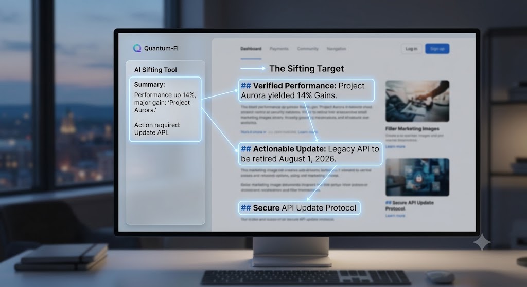
A. The Sifting Pattern
Before a user even looks at your live page, their browser (like Arc, Safari, or Chrome) has likely already generated an AI summary of your content. When they actually look at your page, they aren't reading—they are sifting to verify. They are looking for the exact quote, the specific price point, or the source data that proves the AI summary right.
- How to design for it: Ditch clever, mysterious headings. Use highly specific, data-driven H2s. If your H2 says "A Better Way to Budget," change it to "Save 14% Annually with Automated Micro-Budgets." Let their eyes find the proof instantly.

B. The Pinball Scan
On pages with interactive elements—like dynamic calculators, 3D product previews, or live charts—user attention doesn't scroll; it bounces. Their eyes dart erratically from an interactive widget to a nearby text snippet, back to the widget, and then to a testimonial. It looks like a pinball machine.
- How to design for it: Never isolate your copy from your tools. Put your most critical micro-copy, warnings, or value propositions directly inside or immediately adjacent to your interactive elements. Dribble provides some great examples of pinball scan designs on their website.
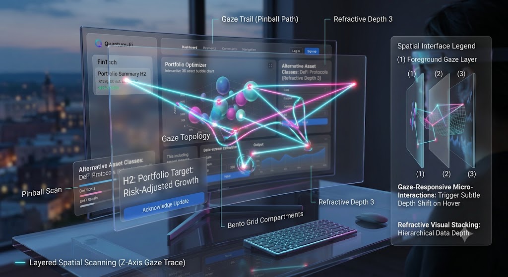
C. Layered Spatial Scanning (The Z-Axis)
With the rapid expansion of the eye-tracking market—growing at a 31.9% CAGR into 2026 driven heavily by wearable tech and head-mounted displays—users have trained their brains to look through pages, not just across them. They scan for visual depth.
- How to design for it: Use subtle drop shadows, overlapping containers, and frosted-glass ("glassmorphism") effects to visually stack information. Items physically "closer" to the user's face are processed as high priority, while background layers are scanned as supporting context. take a look
2. The 2026 Dead Zones (What Users Silently Ignore)
If your website still relies on early-2020s design templates, you are likely losing attention to "dead zones"—areas of a page that the human brain now automatically filters out as noise.
- The Overdesigned Hero Section: Users have developed terminal blindness to massive, generic stock photos with a vague headline like "Empowering Your Digital Future." They scroll past this giant block of nothingness in less than a second.
- Monolithic Text Walls: If a paragraph is longer than three lines, it does not exist. The eye simply glides over it, searching for a bulleted list, a bolded metric, or a button.
- Unresponsive Static Layouts: If a user hovers over an element and it doesn't offer a micro-interaction (a tiny color shift, a slight lift, or a change in state), they assume the page is static, dead, or untrustworthy, and their gaze moves on.
3. The New Rules of Layout Hygiene
To keep up with these behaviors, your design system needs to prioritize visual stability and clear containment.
Eliminate Layout Shifts (CLS)
Nothing kills user trust faster than a page that jumps around while loading. In fact, web benchmarks show that 88.5% of website visitors cite slow loading times or jarring visual friction as a primary reason they leave a site. If an image, ad, or font loads late and pushes your text down, the user's eye-tracking flow is broken. Visual stability equals editorial authority.
Embrace the Bento Grid
To help the brain categorize information in milliseconds, lean into "Bento Grid" layouts—modular, hard-bordered containers of varying sizes. This tactile style of design chunking allows users to treat each section of your page as an independent, easily digestible micro-topic.
Technical & Research Resources
To dive deeper into the data and implement these patterns safely, consult these core industry benchmarks and toolkits:
- Nielsen Norman Group (NN/G): The foundational authority on text scanning patterns and eye-tracking heatmaps.
- Google Web Dev - Cumulative Layout Shift (CLS): The official technical guide on measuring and preventing unexpected layout shifts to maintain visual stability.
- BentoGrids.xyz: A curated gallery of modular structural design examples across modern SaaS and product interfaces.
- W3C Web Accessibility Initiative (WAI): Guidelines to ensure that Z-axis overlays, spatial styling, and interactive micro-copy remain fully readable by screen readers and accessible to all users.
In Conclusion: Design for the Scan, Not the Scroll
Designing a website in 2026 is no longer about forcing a reader down a single, linear path. It is about building an intuitive map where they can easily find what they are already looking for.
Stop trying to make them read. Start helping them find.
If you have any questions on the information provided please contact DaBrian Marketing online, or give us a call at 610-743-5602.
 Website design,
Web Design Trends,
website development,
website redesign,
Web Design Strategy/Website Strategy
Website design,
Web Design Trends,
website development,
website redesign,
Web Design Strategy/Website Strategy
Subscribe to our Blog
Recent Posts
Categories
- Marketing Strategy (126)
- web design (83)
- digital marketing (73)
- Search Engine Optimization (SEO) (62)
- Paid Search (PPC) (59)
- Digital Analytics (55)
- seo (51)
- Google Analytics (50)
- News & Events (48)
- Social Media Marketing & Management (47)
- Content Marketing (45)
- PPC (43)
- Ecommerce & Retail Marketing (39)
- Business to Business Marketing (34)
- Website design (34)
- Mobile marketing (33)
- local seo (32)
- eCommerce (31)
- Inbound marketing (29)
- B2B marketing (27)
- social media (26)
- email marketing (25)
- social media marketing (25)
- website redesign (25)
- B2B (24)
- Financial Services (23)
- website development (23)
- Pay Per Click (20)
- SEO strategy (20)
- B2B marketing agency (19)
- marketing (19)
- web development (19)
- Google AdWords (17)
- marketing automation (17)
- press release (16)
- Social Media Management (15)
- ecommerce marketing (15)
- lead generation (15)
- social media strategy (15)
- Web Design Strategy/Website Strategy (14)
- content (14)
- web design services for small business (14)
- Web Design Trends (13)
- financial services marketing (13)
- sales (13)
- Digital Branding (12)
- Healthcare & Wellness (12)
- Social Strategy (12)
- Video Marketing (12)
- branding (12)
- search engine optimization (12)
- Analytics (11)
- Artificial intelligence (AI) (11)
- Retail Marketing (11)
- SEM (11)
- digital advertising (11)
- increase brand awareness (11)
- internet marketing (11)
- online shopping (11)
- responsive web design (11)
- web analytics (11)
- Healthcare Marketing (10)
- Home Services (10)
- Lead Generation Marketing (10)
- SEO Services (10)
- financial advisors marketing (10)
- local listing management (10)
- Bank Marketing (9)
- CRM (9)
- Content Planning (9)
- Google Ads (9)
- Inbound Marketing Strategies (9)
- PPC Marketing (9)
- WordPress (9)
- content development (9)
- content strategy (9)
- redesign website (9)
- web designer (9)
- 2024 Planning (8)
- B2C Marketing (8)
- Retail Sales (8)
- Shopify (8)
- Social Media Metrics (8)
- Web Security (8)
- b2b sales (8)
- financial marketing (8)
- project management (8)
- social marketing (8)
- social media analytics (8)
- strategic marketing (8)
- website (8)
- 2025 Planning (7)
- AdWords (7)
- Bing Ads (7)
- Mobile design (7)
- ROI (7)
- Sales Strategy (7)
- brand identity (7)
- business strategy (7)
- content optimization (7)
- home services marketing (7)
- link building (7)
- mobile (7)
- mobile website (7)
- ppc advertising (7)
- social tips (7)
- AI Content (6)
- CMS (6)
- Customer Persona (6)
- Link Earning (6)
- Online Sales (6)
- SEO Agency (6)
- SEO measurement (6)
- Search Engine Marketing (6)
- account-based marketing (6)
- brand development (6)
- digital marketing agency (6)
- digital marketing strategy (6)
- hubspot cms (6)
- keyword research (6)
- measurement (6)
- news and events (6)
- shopify website (6)
- shopping ads (6)
- small business (6)
- social analytics (6)
- strategy (6)
- Paid Search (5)
- Plumbing Marketing (5)
- brand guidelines (5)
- business to business (5)
- customer relationship management (5)
- customer relationship management tools (5)
- google shopping (5)
- hubspot agency (5)
- inbound marketing strategy (5)
- lead generation website (5)
- marketing insights (5)
- marketing tips (5)
- measuring SEO (5)
- paid search campaigns (5)
- ppc management (5)
- sales CRM (5)
- user experience (5)
- video (5)
- web developer (5)
- 2026 planning (4)
- Artificial Intelligence (4)
- CMS Hub (4)
- Call Tracking (4)
- Facebook (4)
- Improve productivity (4)
- Inbound Sales Strategy (4)
- Insurance Marketing (4)
- KPIs (4)
- Local Listings (4)
- Logo Design (4)
- Non-Profit Marketing (4)
- Organic Search (4)
- Outbound Sales Strategy (4)
- SERPS (4)
- Social media updates (4)
- Uncategorized (4)
- Wealth Management marketing (4)
- aeo (4)
- compliance (4)
- conversions (4)
- creative design (4)
- credit union (4)
- customer relationship system (4)
- dabrian marketing (4)
- data (4)
- ecommerce SEO (4)
- email (4)
- home improvement (4)
- leads (4)
- local search (4)
- manufacturing marketing (4)
- mobile advertising (4)
- news (4)
- optimization (4)
- paid online advertising (4)
- sales funnel (4)
- sales pipeline (4)
- security (4)
- smart goals (4)
- social advertising (4)
- social media tips (4)
- tag management (4)
- trends (4)
- 2023 (3)
- AI SEO (3)
- Adobe Analytics (3)
- Amazon Advertising (3)
- Automotive Marketing (3)
- B2B Content (3)
- B2B Search Marketing (3)
- B2B eCommerce (3)
- B2C (3)
- Continuous Website Improvement (3)
- Google My Business (3)
- Growth Driven Design (3)
- HVAC (3)
- Home Improvement Marketing (3)
- Hospital Marketing (3)
- Lawn Care Marketing (3)
- LinkedIn (3)
- Marketing Budgeting (3)
- Measurement Planning (3)
- Multivariate Testing (3)
- Online Business (3)
- Partnership (3)
- Personas (3)
- Product Inventory (3)
- SEO Reporting (3)
- SOCIAL ECOMMERCE (3)
- Sales Prospecting (3)
- Sales and Marketing Alignment (3)
- Speed-to-Lead (3)
- Time Management (3)
- Twitter (3)
- UX Design (3)
- UX research (3)
- adCenter (3)
- advertising (3)
- api (3)
- attribution modeling (3)
- bank advertising (3)
- big data (3)
- construction marketing (3)
- consumer services (3)
- customer (3)
- data privacy (3)
- digital content (3)
- digital marketing measurement (3)
- digital marketing services (3)
- email for ecommerce (3)
- facebook ads (3)
- google partners connect (3)
- graphic design (3)
- hubspot (3)
- hubspot crm (3)
- hubspot sales (3)
- instagram (3)
- marketing metrics (3)
- minority owned businesses (3)
- monitor (3)
- omnichannel Marketing (3)
- on-page seo (3)
- online reputation management (3)
- online store (3)
- paid search advertising (3)
- pay per click advertising campaigns (3)
- plumbing (3)
- ppc account management (3)
- reputation management (3)
- sales enablement (3)
- tips (3)
- voice search (3)
- #agencylife (2)
- 2022 (2)
- 2023 planning (2)
- 2024 (2)
- ABM (2)
- B2B growth (2)
- BigCommerce (2)
- Business growth opportunities (2)
- COVID (2)
- CRM alignment (2)
- Conversion Tracking (2)
- Covid-19 (2)
- Facebook Tips (2)
- Facebook business (2)
- GDPR (2)
- Gmail tips (2)
- Google Business Profile (2)
- Google event (2)
- Home Improvement Trends (2)
- LinkedIn Ads (2)
- Local SEO Strategy (2)
- Logistics (2)
- Minority Business Enterprise (2)
- Online Advertising (2)
- Product Data Feed (2)
- Qualitative Data (2)
- Restaurant Marketing (2)
- SBE (2)
- Twitter Tips (2)
- UX (2)
- Video SEO (2)
- Yelp (2)
- ad copy (2)
- agency transparency (2)
- algorithm management (2)
- automated bidding (2)
- budget (2)
- business growth (2)
- certification (2)
- client appreciation (2)
- clients (2)
- cloud (2)
- communication (2)
- content promotion (2)
- copywriting (2)
- data driven culture (2)
- data driven marketing (2)
- data mining (2)
- design (2)
- digital avertising (2)
- digital transformation (2)
- digital vs traditional (2)
- education (2)
- email analytics (2)
- email marketing measurement (2)
- enhanced campaigns (2)
- guide (2)
- healthcare marketing agency (2)
- hootsuite (2)
- hosting services (2)
- implementing (2)
- inbound leads (2)
- inbound success plan (2)
- industries (2)
- industry solutions (2)
- insurance and trust (2)
- interactive content (2)
- internet (2)
- landing (2)
- landing page (2)
- lead generation tools (2)
- lehigh valley (2)
- local business (2)
- local event (2)
- local listing (2)
- logo types (2)
- marketing tools (2)
- measure (2)
- medical marketing (2)
- mobile analytics (2)
- mobile app (2)
- mobile optimization (2)
- mobile seo (2)
- multichannel (2)
- multichannel marketing (2)
- native ads (2)
- news release (2)
- non-profit (2)
- nonprofit marketing (2)
- one page web design (2)
- operations process (2)
- outbound marketing (2)
- phone calls (2)
- platform (2)
- rackspace (2)
- reading pa (2)
- remarketing (2)
- retargeting (2)
- sales plan (2)
- segmentation (2)
- self marketing (2)
- social (2)
- social commerce (2)
- social media agency (2)
- staffing and recruitment (2)
- successful (2)
- target audience (2)
- tariffs (2)
- technical seo (2)
- testing (2)
- tracking (2)
- universal analytics (2)
- website optimization (2)
- work platforms (2)
- workflows (2)
- 1 page sales plan (1)
- 2021 (1)
- 2022 planning (1)
- 3pl (1)
- 5 basic principles (1)
- AAF (1)
- AAF-GLV (1)
- ADA Compliance (1)
- AI (1)
- Alignment (1)
- American Advertising Federation (1)
- American Advertising Federation Greater Lehigh Val (1)
- Answer Engine Optimization (1)
- AuthorRank (1)
- B2B Marketing Strategy (1)
- Backlinks (1)
- Bank Lead Generation (1)
- Brightlocal (1)
- Budget Planning (1)
- Business Operations (1)
- ChatGPT Marketing (1)
- Cheap SEO Services (1)
- Cloud U (1)
- Cold Calls (1)
- Cold Email (1)
- Cold Outreach (1)
- Contractor Lead Generation (1)
- Copywriter (1)
- Customer Acquisition (1)
- Digital Health Marketing (1)
- Display Advertising (1)
- Dynamic Text (1)
- Ecommerce Strategy (1)
- Employee Advocacy (1)
- Feed Optimization (1)
- Financial SEO (1)
- First Party Data (1)
- Fractional Marketing (1)
- GK Elite (1)
- General (1)
- Generative Engine Optimization (1)
- Google AI Mode for Healthcare (1)
- Google Ads 2026 (1)
- Google Guidelines (1)
- Google Manufacturer Center (1)
- Google Marketing Live (1)
- Google Rankbrain (1)
- Google Rankings (1)
- Google reviews (1)
- Google+ (1)
- Growth Strategy (1)
- HIPAA Compliance (1)
- HIPAA Compliant Marketing (1)
- HIPPA Compliance (1)
- HVAC & Plumbing Strategy (1)
- Healthcare AI Search (1)
- Healthcare Advertising (1)
- Healthcare Automation (1)
- Healthcare Strategy (1)
- Hospitality & Travel (1)
- Hubspot Onboarding (1)
- Hybrid Manufacturing (1)
- Independent Medical Practice (1)
- Independent Medical Practices (1)
- Independent Practice (1)
- Landscaping (1)
- Landscaping Marketing (1)
- Legal advice (1)
- Load-Time (1)
- MBE (1)
- MWBE (1)
- Maintenance Membership (1)
- Manufacturing (1)
- Medial PPC (1)
- Medical Practice Growth (1)
- Medical Practice Marketing (1)
- Medical Practice SEO (1)
- Microsoft adCenter (1)
- Millennials (1)
- ODYSSEY Battery (1)
- Operational Efficiency (1)
- Patient Reactivation (1)
- Pest Control Marketing (1)
- Pipedrive (1)
- Practice Growth (1)
- Practice Management (1)
- Programmatic Advertising (1)
- Project Management Systems (1)
- Q4 Healthcare Marketing (1)
- Quality Score (1)
- ROAS (1)
- Recurring Revenue (1)
- Regulation S-P (1)
- SEC Mandate (1)
- SEO strategy in 2015 (1)
- Sales Calls (1)
- Shopify partner (1)
- Shoulder Season (1)
- Soc (1)
- Specialty Practice Marketing (1)
- Toptrends (1)
- URL Structure (1)
- URL tagging (1)
- User Behavior (1)
- VeteransDay (1)
- Wealth Management (1)
- Woocommerce (1)
- accessibilitiy (1)
- accessibility (1)
- accounts (1)
- administrative (1)
- advisor efficiency (1)
- align (1)
- analytics framework (1)
- artisanal cheese (1)
- attribution (1)
- audience segmentation (1)
- authorship (1)
- auto dealers (1)
- b2b buying habits (1)
- bidding strategy (1)
- blog (1)
- bounce rate (1)
- brand culture (1)
- branded search (1)
- bug (1)
- business (1)
- business development (1)
- business plan (1)
- business systems (1)
- business tech (1)
- buyer's journey (1)
- buying process (1)
- campaign tagging (1)
- campaign tracking (1)
- candidate marketing (1)
- capturing (1)
- cause marketing (1)
- citations (1)
- click-and-mortar (1)
- column hack (1)
- combination marks (1)
- competitor analysis (1)
- competitor research (1)
- content hub (1)
- content syndication (1)
- conversion (1)
- cost data (1)
- cpa (1)
- cpc (1)
- crowdsourced marketing (1)
- crowdsourcing (1)
- customer journey (1)
- customer segments (1)
- cyber monday (1)
- daa symposium (1)
- data security (1)
- dental marketing (1)
- desktop design (1)
- don draper (1)
- downtown improvement district (1)
- efforts (1)
- election (1)
- email campaigns (1)
- email design (1)
- email guidelines (1)
- email organizing tips (1)
- emblems (1)
- emergency search (1)
- engagement (1)
- enterprise search (1)
- event (1)
- event sponsorship (1)
- exact (1)
- expansion (1)
- experiments (1)
- free website (1)
- ga (1)
- geo (1)
- gmail tricks (1)
- google authorship (1)
- greater lehigh valley chamber of commerce (1)
- growth strategies (1)
- heartbleed (1)
- hiring (1)
- hubspot content hub (1)
- hubspot solutions partner (1)
- icons (1)
- increase (1)
- industrial manufacturing (1)
- infographic (1)
- integrated marketing (1)
- integration (1)
- inventory file (1)
- kerning (1)
- keyword match types (1)
- keywords (1)
- law firm (1)
- law firm marketing (1)
- law practice (1)
- legal services (1)
- letter marks (1)
- life science (1)
- local service ads (1)
- logo creation (1)
- logos (1)
- mad men (1)
- maintenance (1)
- marketing attribution (1)
- marketing event (1)
- marketing for law (1)
- marketing hub (1)
- medical practices (1)
- meetings (1)
- member insights (1)
- metrics (1)
- mobile banking (1)
- multitasking (1)
- myth (1)
- new (1)
- new hire (1)
- new year's resolution (1)
- newhire (1)
- nonprofit (1)
- office (1)
- one page website (1)
- online marketing (1)
- opportunity house (1)
- outdated (1)
- pages (1)
- parallax scrolling (1)
- partner (1)
- personalization (1)
- pharma marketing (1)
- pharmaceutical (1)
- pitfalls (1)
- pivot tables (1)
- predictive marketing (1)
- privacy (1)
- problem planning (1)
- product feed (1)
- productivity (1)
- project manager (1)
- project mgmt system (1)
- projects (1)
- prospects (1)
- quality (1)
- rank higher (1)
- recruiting (1)
- regulated (1)
- relations (1)
- remote workspace (1)
- return on ad spend (1)
- reviews (1)
- rich snippets (1)
- robo advisors (1)
- sales automation (1)
- sales enablement tools (1)
- sales goals (1)
- say cheese reopening (1)
- schema markup (1)
- search engines (1)
- search intent (1)
- search rankings (1)
- search visibility (1)
- seocial (1)
- sequences (1)
- single page website (1)
- snap map (1)
- snapchat (1)
- snapchat business (1)
- snapchat tips (1)
- social media marketing agencies (1)
- social media tools (1)
- social monitoring (1)
- socialytics (1)
- storytelling (1)
- superiors (1)
- supply chain (1)
- symbols (1)
- tag management solution (1)
- tagline development (1)
- task management (1)
- team (1)
- thankyouforyourservice (1)
- time blocking (1)
- traditional marketing (1)
- tutorial (1)
- twitter business (1)
- user experience research (1)
- video production (1)
- video strategy (1)
- virtual reality (1)
- visibility (1)
- volunteerism (1)
- webinar (1)
- website updates (1)
- white paper (1)
- word marks (1)
- work from home (1)
- work tools (1)
- yahoo mail (1)
Archives
- April 2025 (8)
- July 2025 (8)
- December 2025 (8)
- July 2026 (8)
- August 2026 (8)
- September 2012 (7)
- May 2026 (7)
- August 2015 (6)
- February 2016 (6)
- July 2016 (6)
- January 2017 (6)
- May 2017 (6)
- June 2025 (6)
- October 2025 (6)
- June 2026 (6)
- May 2012 (5)
- April 2013 (5)
- May 2013 (5)
- June 2013 (5)
- July 2013 (5)
- July 2014 (5)
- October 2014 (5)
- January 2015 (5)
- July 2015 (5)
- October 2015 (5)
- May 2016 (5)
- June 2016 (5)
- October 2016 (5)
- March 2017 (5)
- April 2017 (5)
- April 2022 (5)
- May 2022 (5)
- June 2022 (5)
- November 2022 (5)
- February 2024 (5)
- July 2024 (5)
- October 2024 (5)
- March 2025 (5)
- September 2025 (5)
- November 2025 (5)
- March 2026 (5)
- April 2026 (5)
- June 2011 (4)
- April 2012 (4)
- June 2012 (4)
- July 2012 (4)
- August 2012 (4)
- October 2012 (4)
- November 2012 (4)
- January 2013 (4)
- February 2013 (4)
- September 2013 (4)
- October 2013 (4)
- March 2014 (4)
- June 2014 (4)
- August 2014 (4)
- September 2014 (4)
- November 2014 (4)
- March 2015 (4)
- May 2015 (4)
- June 2015 (4)
- January 2016 (4)
- August 2016 (4)
- September 2016 (4)
- November 2016 (4)
- December 2016 (4)
- June 2017 (4)
- March 2018 (4)
- December 2018 (4)
- May 2019 (4)
- January 2021 (4)
- April 2021 (4)
- October 2021 (4)
- December 2021 (4)
- January 2022 (4)
- February 2022 (4)
- March 2022 (4)
- July 2022 (4)
- September 2022 (4)
- February 2023 (4)
- July 2023 (4)
- August 2023 (4)
- October 2023 (4)
- December 2023 (4)
- April 2024 (4)
- May 2024 (4)
- August 2024 (4)
- February 2025 (4)
- January 2026 (4)
- February 2026 (4)
- September 2026 (4)
- January 2012 (3)
- December 2012 (3)
- March 2013 (3)
- August 2013 (3)
- November 2013 (3)
- February 2014 (3)
- April 2014 (3)
- May 2014 (3)
- December 2014 (3)
- February 2015 (3)
- April 2015 (3)
- September 2015 (3)
- November 2015 (3)
- December 2015 (3)
- March 2016 (3)
- April 2016 (3)
- August 2017 (3)
- October 2017 (3)
- October 2018 (3)
- January 2019 (3)
- February 2019 (3)
- October 2019 (3)
- February 2020 (3)
- August 2020 (3)
- October 2020 (3)
- November 2020 (3)
- December 2020 (3)
- March 2021 (3)
- July 2021 (3)
- August 2021 (3)
- September 2021 (3)
- August 2022 (3)
- December 2022 (3)
- January 2023 (3)
- March 2023 (3)
- April 2023 (3)
- May 2023 (3)
- January 2024 (3)
- March 2024 (3)
- June 2024 (3)
- September 2024 (3)
- November 2024 (3)
- January 2025 (3)
- August 2025 (3)
- July 2011 (2)
- September 2011 (2)
- November 2011 (2)
- February 2012 (2)
- December 2013 (2)
- February 2017 (2)
- July 2017 (2)
- September 2017 (2)
- May 2018 (2)
- August 2018 (2)
- September 2018 (2)
- March 2019 (2)
- December 2019 (2)
- March 2020 (2)
- July 2020 (2)
- February 2021 (2)
- May 2021 (2)
- June 2021 (2)
- October 2022 (2)
- June 2023 (2)
- September 2023 (2)
- November 2023 (2)
- May 2025 (2)
- March 2010 (1)
- May 2011 (1)
- August 2011 (1)
- October 2011 (1)
- December 2011 (1)
- March 2012 (1)
- January 2014 (1)
- January 2018 (1)
- April 2018 (1)
- June 2018 (1)
- July 2018 (1)
- November 2018 (1)
- April 2019 (1)
- July 2019 (1)
- November 2019 (1)
- January 2020 (1)
- September 2020 (1)
- November 2021 (1)
- December 2024 (1)